使用lattice进行高级绘图
王诗翔 · 2018-06-07
使用lattice进行高级绘图是我之前在学习《R实战》这本书少有涉及的章节之一,在R里面,主要有两大底层图形系统,一是base,二是grid。lattice与ggplot2正是基于grid构建,它们都有自己独特的图形语法。我当前使用的主要是ggplot2,base画图基本不用,这里学习下lattice包并想后续深入学习绘图的底层原理与实现。 内容:
- lattice包介绍
- 分组与调节
- 在面板函数中添加信息
- 自定义lattice图形的外观 这几年开始学习R语言的估计对ggplot2要比lattice包熟悉很多,后者虽然在初学者中名声不显,但就凭lattice内置于R,而ggplot2要额外安装来看,前者毫无疑问是被前辈们所广泛使用的,这篇文章来正式学习一下。
我们将一起学习Deepayan Sarkar(2008)编写的lattice包,它实现了Cleveland(1983,1993)提出的网格图形。lattice包已经超越了Cleveland的初始可视化数据的方法,并且提供了一系列创建统计图形的复杂方法。
像ggplot2一样,lattice图形有它自己的语法,提供了对基础图形的替代方案,并且擅长绘制复杂数据。
lattice包
网格图形能够展示变量的分布或变量之间的关系,每幅图代表一个或多个变量的各个水平。思考下面一个问题:纽约合唱团各声部的歌手身高是如何变化的?
lattice包在singer数据集中提供了这两个变量的数据:
library(lattice)
histogram(~height | voice.part, data = singer, main = "Distribution of Heights by Voice Pitch",
          xlab = "Height (inches)")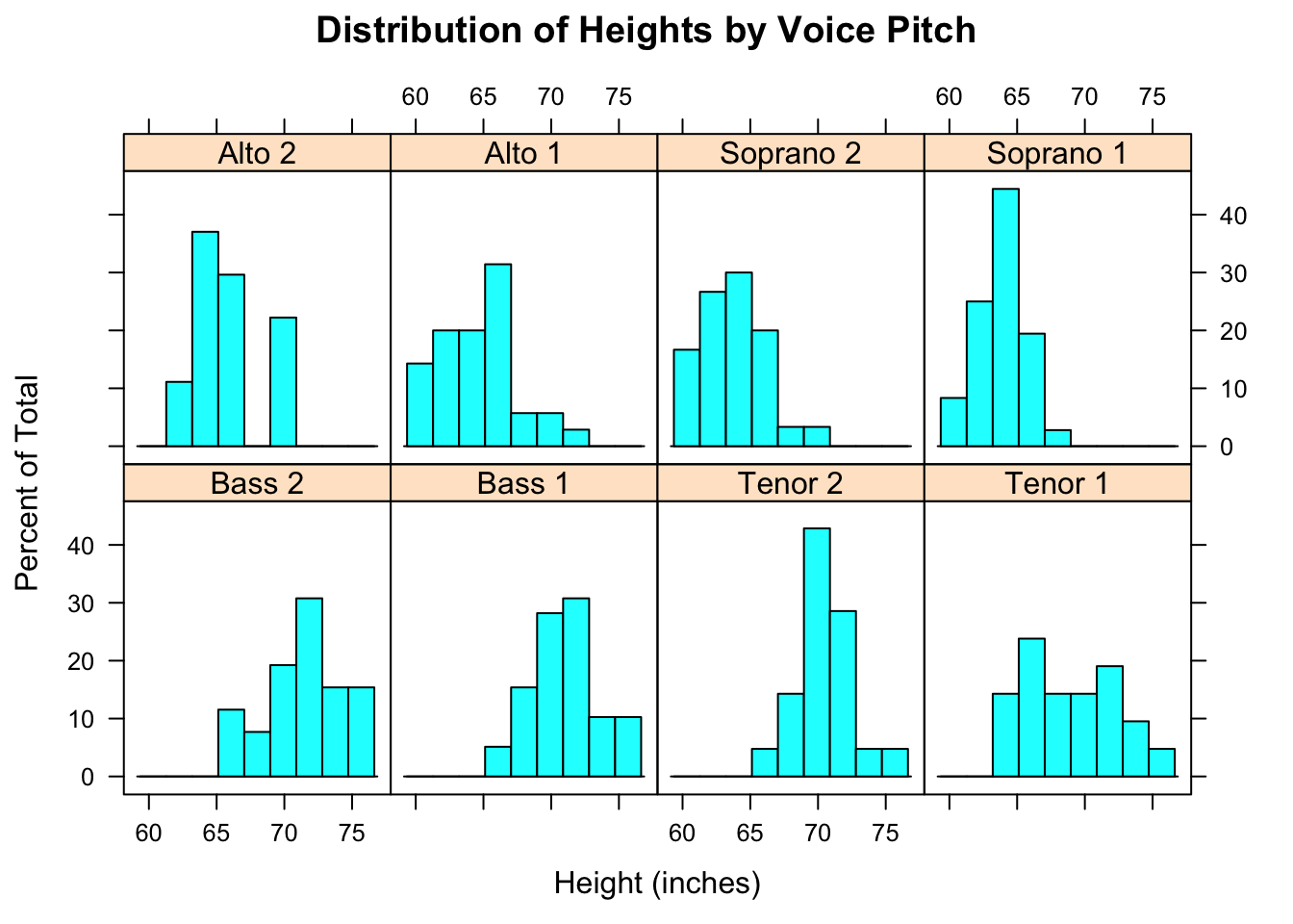
从这幅图可以看出,似乎男高音和男低音比女低音和女高音的身高更高。
在网格图中,调节变量的每个水平生成一个独立的面板。如果指定多个调节变量,这些变量因子水平的每个组合都会生成一个面板(类似于ggplot2中的分面概念)。面板被分配到数组中以便于比较。在每个面板名为条带的区域中会提供一个标签。用户可以控制每个面板上的图形,条板的格式与放置的位置,面板的安排,图例的放置和内容以及其他许多的图形特征。
lattice包提供了大量的函数来产生单因素图(点图、核密度图、直方图、条形图与箱线图),二元图(散点图、条形图、平行箱线图)和多元图(3D图、散点图矩阵)。每个高水平的画图函数都服从下面的格式:
graph_function(formula, data=, options)- graph_function 是下表的一个函数;
- formula 指定要展示的变量和任意的调节变量;
- data 指定数据框;
- options 是用逗号分隔的参数,用来调整图形的内容、安排和注释。
我们假定小写字母代表数值型变量,大写字母代表分类型变量(因子)。高水平的画图函数通常采用的格式是:
y ~ x | A * B其中竖线左侧称为主要变量,右边的变量称为调节变量。
| 图类型 | 函数 | 公式例子 |
|---|---|---|
| 3D等高线图 | contourplot() | z~x*y |
| 3D水平图 | levelplot() | z~y*x |
| 3D散点图 | cloud() | z~x*y|A |
| 3D线框图 | wireframe() | z~y*x |
| 条形图 | barchart() | x~A或A~x |
| 箱线图 | bwplot() | x~A或A~x |
| 点图 | dotplot() | ~x|A |
| 柱状图/直方图 | histogram() | ~x |
| 核密度图 | densityplot() | ~x|A*B |
| 平行坐标曲线图 | parallelplot() | dataframe |
| 散点图 | xyplot() | y~x|A |
| 散点图矩阵 | splom() | dataframe |
| 线框图 | stripplot() | x~A或A~x |
为了尽快对lattice图有一个认识,我们尝试运行下面的代码。里面的图基于mtcars数据框中的汽车数据(里程、车重、挡数、汽缸数等)。
library(lattice)
attach(mtcars)
gear <- factor(gear, levels = c(3, 4, 5),
               labels = c("3 gears", "4 gears", "5 gears"))
cyl <- factor(cyl, levels = c(4, 6, 8),
              labels = c("4 cylinders", "6 cylinders", "8 cylinders"))
# 开始画图
densityplot(~mpg, main = "Density Plot",
            xlab = "Miles per Gallon")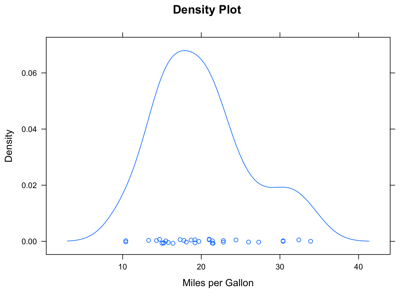
densityplot(~mpg | cyl,
            main = "Density Plot by Number of Cylinders",
            xlab = "Miles per Gallon")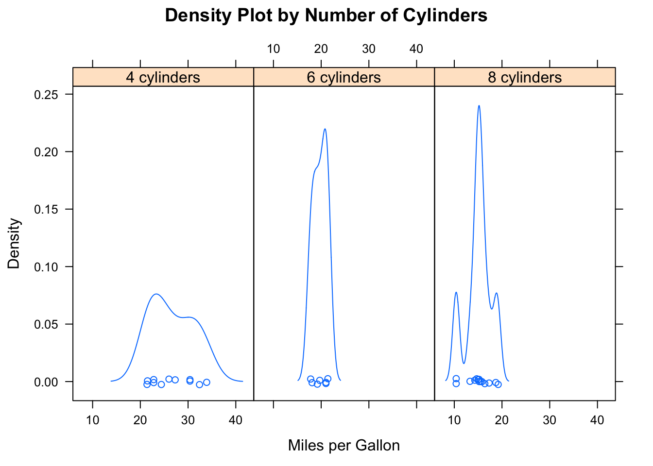
bwplot(cyl ~ wt | gear,
       main = "Box Plots by Cylinders and Gears",
       xlab = "Miles per Gallon",
       ylab = "Cylinders")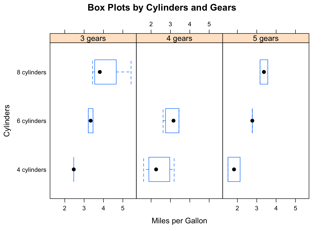
xyplot(mpg ~ wt | cyl * gear,
       main = "Scatter Plots by Cylinders and Gears",
       xlab = "Car Weight", ylab = "Miles per Gallon")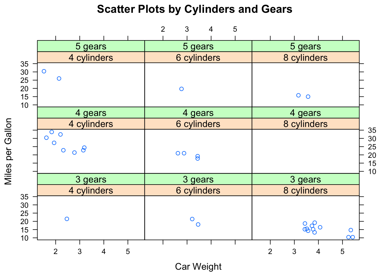
cloud(mpg ~ wt * qsec | cyl,
      main = "3D Scatter Plots by Cylinders")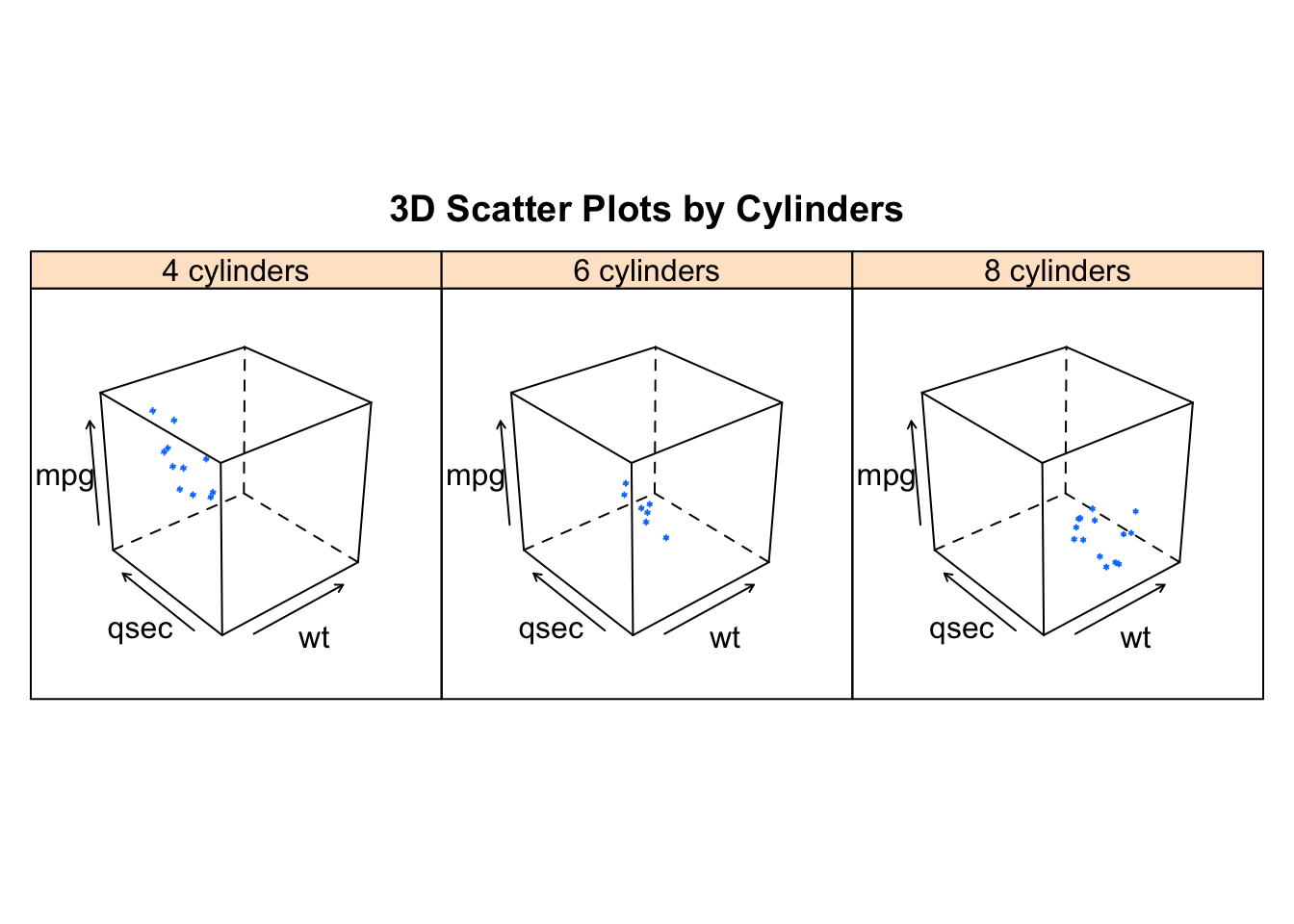
dotplot(cyl ~ mpg | gear,
        main = "Dot Plots by Number of Gears and Cylinders",
        xlab = "Miles Per Gallon")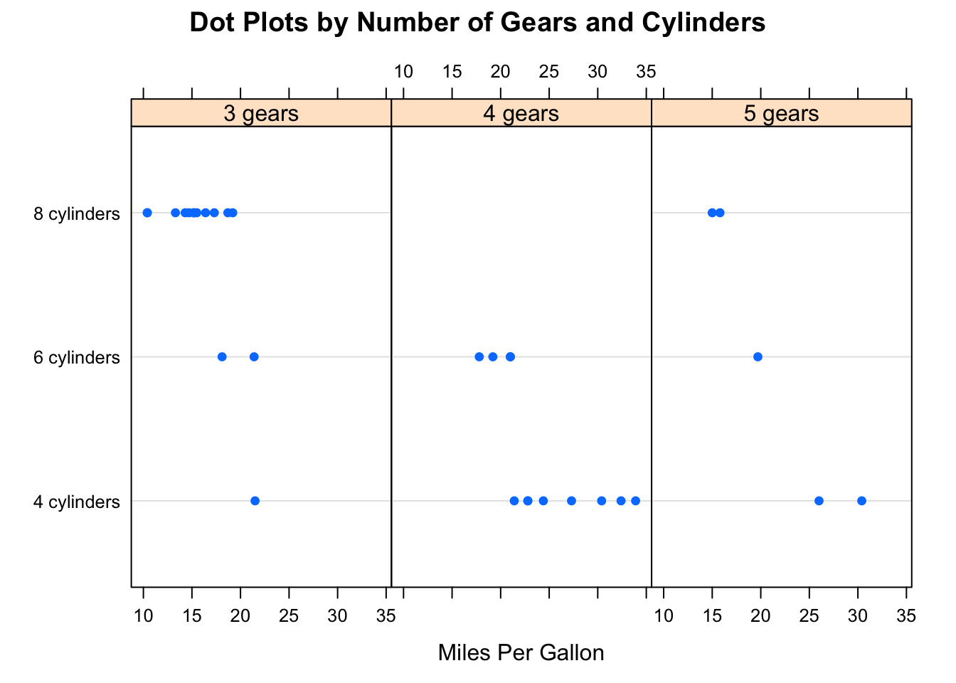
splom(mtcars[c(1:6)],
      main = "Scatter Plot Matrix for mtcars Data")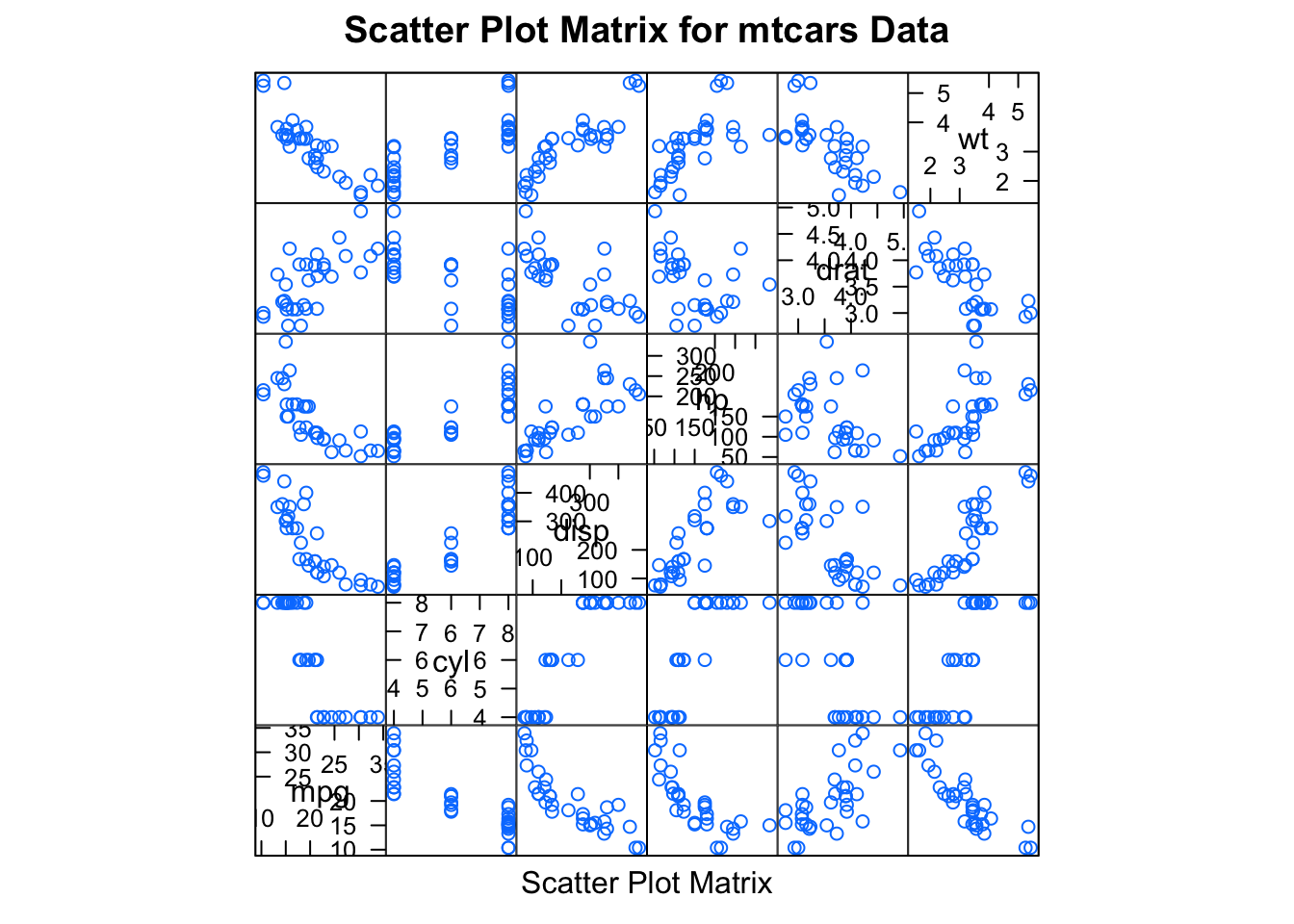
detach(mtcars)其中ggplot2不能画3D图形,而lattice可以。 lattice包中的高水平画图函数能产生可保存和修改的图形对象,例如:
library(lattice)
mygraph <- densityplot(~height|voice.part, data=singer)创建一个网格密度图,并把它保存为对象mygraph,但是没有图形展示。使用plot(mygraph)将会显示该图。
通过调整选项很容易更改lattice图形,常见的选项列在下表中:
| 选项 | 描述 |
|---|---|
| aspect | 指定每个面板图形的纵横比(高度/宽度)的一个数字 |
| col、pch、lty、lwd | 分别指定在图中使用的颜色、符号、线类型和线宽度的向量 |
| group | 分组变量(因子) |
| index.coord | 列出展示面板顺序的列表 |
| key (auto.key) | 支持分组变量中图例的函数 |
| layout | 指定面板设置(列数与行数)的二元素数值向量,如果需要,可以增加一个元素来表示页面数 |
| main、sub | 指定主标题和副标题的字符向量 |
| panel | 在每个面板中生成图的函数 |
| scales | 列出提供坐标轴注释信息的列表 |
| strip | 用于自定义面板条带的函数 |
| split、position | 数值型向量,在一页上绘制多幅图像 |
| type | 指定一个或多个散点图绘图选项(p=点、l=线、r=回归线、smooth=局部多项式回归拟合、g=网格图形)的字符向量 |
| xlab、ylab | 指定横轴和纵轴标签的字符向量 |
| xlim、ylim | 指定横轴和纵轴最小值、最大值的二元数值向量 |
我们可以在高级函数内部或者后面讨论的面板函数内使用这些选项。
我们也可以使用update()函数来调整lattice图形对象。
继续歌手的例子:
plot(mygraph)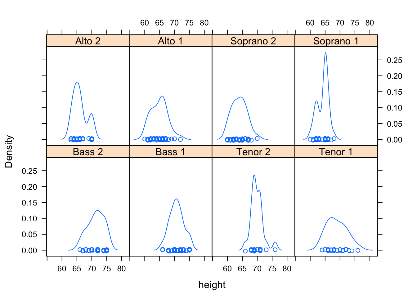
update(mygraph, col="red", pch=16, cex=.8, jitter=.05, lwd=2)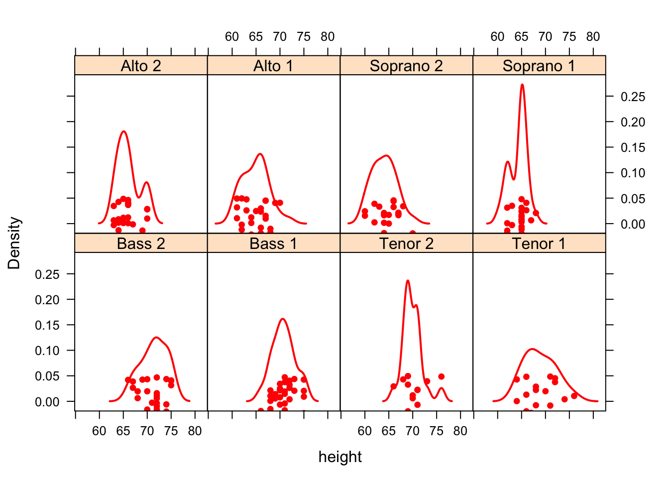
调节变量
通常情况下,调节变量是因子。但是对于连续的变量该如何操作呢?一种方式是使用R的cut()函数将连续的变量转换为离散的变量,另一种方法是lattice包提供可以将连续变量转换为名为shingle的数据结构。具体来说,连续变量被分成一系列(可能)重叠的范围。
例如函数
myshingle <- equal.count(x, number=n, overlap=proportion)将连续的变量x分成n个间隔,重叠的比例是proportion,每个间隔里的观测值个数相同,并将其返回为变量myshingle。
一旦变量转化为shingle,就可以用它作为一个调节变量。例如mtcars中的发动机排量是一个连续的变量,我们可以首先把它转换为3水平的shingle变量:
displacement <- equal.count(mtcars$disp, number=3, overlap=0)接下来把它应用到xyplot()函数中:
xyplot(mpg ~ wt|displacement, data = mtcars,
       main = "Miles per Gallon vs. Weight by Engine Displacement",
       xlab = "Weight", ylab = "Miles per Gallon",
       layout = c(3, 1), aspect = 1.5)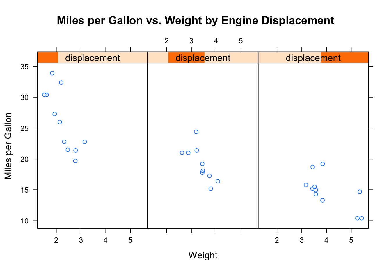
这里我们使用了选项来调整面板的布局(一行3列)和纵横比(高/宽)来让三组的对比变得更容易。
下面我们学习面板函数来进一步自定义输出。
面板函数
每一个高水平的画图函数都采用了默认的函数来绘制面板图。默认函数遵循命名规则panel.graph_function,例如
xyplot(mpg~wt|displacement, data=mtcars)也可以写成:
xyplot(mpg~wt|displacement, data=mtcars, panel=panel.xyplot)这是一个强大的功能,因为它可以让我们用自己设计的默认函数来代替默认的面板函数。我们也可以将lattice包50多个默认函数中的一个或者多个集成到我们自定义的函数中,自定义的面板函数在设计满足我们需求的输出时给了我们很大的灵活性。
下面我们来看些例子。
在前面,我们画出了以汽车发动机排量为条件的汽车重量的油耗,如果你想要加上回归线、地毯图和网格线,我们需要怎么做呢?
library(lattice)
displacement <- equal.count(mtcars$disp, number=3, overlap=0)
mypanel <- function(x, y){
    panel.xyplot(x, y, pch=19)
    panel.rug(x,y)
    panel.grid(h=-1, v=-1) # 添加水平和垂直的网格线
    panel.lmline(x, y, col="red", lwd=1, lty=2) # 添加回归曲线
}
xyplot(mpg ~ wt|displacement, data=mtcars,
       layout=c(3,1),
       aspect=1.5,
       main = "Miles per Gallon vs. Weight by Engine Displacement",
       xlab = "Weight",
       ylab = "Miles per Gallon",
       panel = mypanel)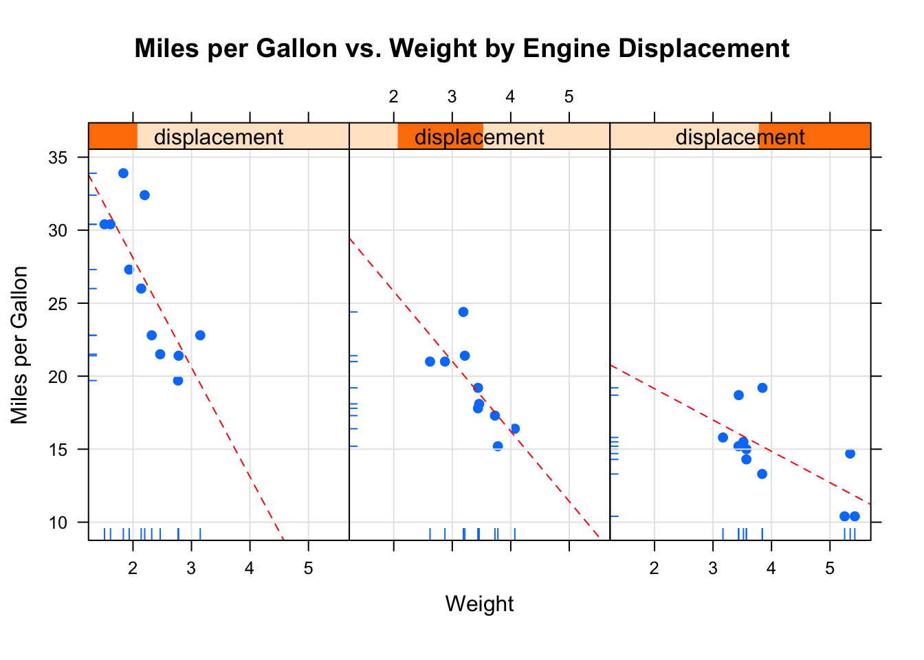
在第二个例子中,我们将画出以汽车变速器类型为条件的油耗和发动机排量之间的关系。除了画出自动和手动变速器发动机独立的面板图外,我们还将添加拟合曲线和水平均值曲线。
library(lattice)
mtcars$transmission <- factor(mtcars$am, levels=c(0,1), labels=c("Automatic", "Manual"))
panel.smoother <- function(x, y){
    panel.grid(h=-1, v=-1)
    panel.xyplot(x, y)
    panel.loess(x, y)
    panel.abline(h = mean(y), lwd = 2, lty = 2, col = "darkgreen")
}
xyplot(mpg~disp|transmission,data=mtcars,
       scales=list(cex=.8, col="red"),
       panel = panel.smoother,
       xlab = "Displacement", ylab = "Miles per Gallon",
       main = "MPG vs Displacement by Transmission Type",
       sub = "Dotted lines are Groups Means", aspect = 1)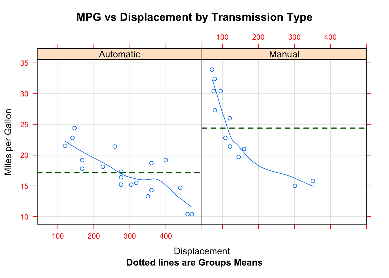
分组变量
当你在lattice绘图公式中增加调节变量时,该变量的每个水平的独立面板就会产生。如果想添加的结果和每个水平正好相反,可以指定改变了为分组变量。
比如说,我们想利用核密度图展示使用手动和自动变速器时汽车的油耗的分布:
densityplot(~mpg, data=mtcars,
            group=transmission,
            main="MPG Distribution by Transmission Type",
            xlab = "Miles per Gallon",
            auto.key = TRUE)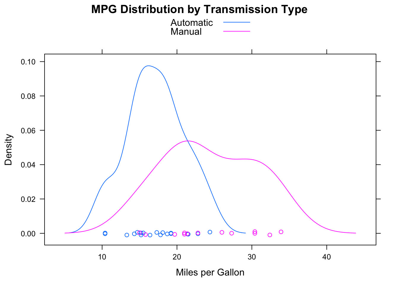
默认情况下,group=选项添加分组变量每个水平的图。值得注意的是,图例和关键字不会在默认情况下生成,这里auto.key=TRUE创建一个基本图例并把它放在图的上方。
下面实现更加自定义的图形:
colors <- c("red", "blue")
lines <- c(1,2)
points <- c(16, 17)
key.trans <- list(title="Transmission",
                  space="bottom", columns=2,
                  text=list(levels(mtcars$transmission)),
                  points=list(pch=points, col=colors),
                  lines=list(col=colors, lty=lines),
                  cex.title=1, cex=.9)
densityplot(~mpg, data=mtcars,
            group=transmission,
            main="MPG Distribution by Transmission Type",
            xlab = "Miles per Gallon",
            pch=points, lty=lines, col=colors,
            lwd=2, jitter=.005,
            key=key.trans)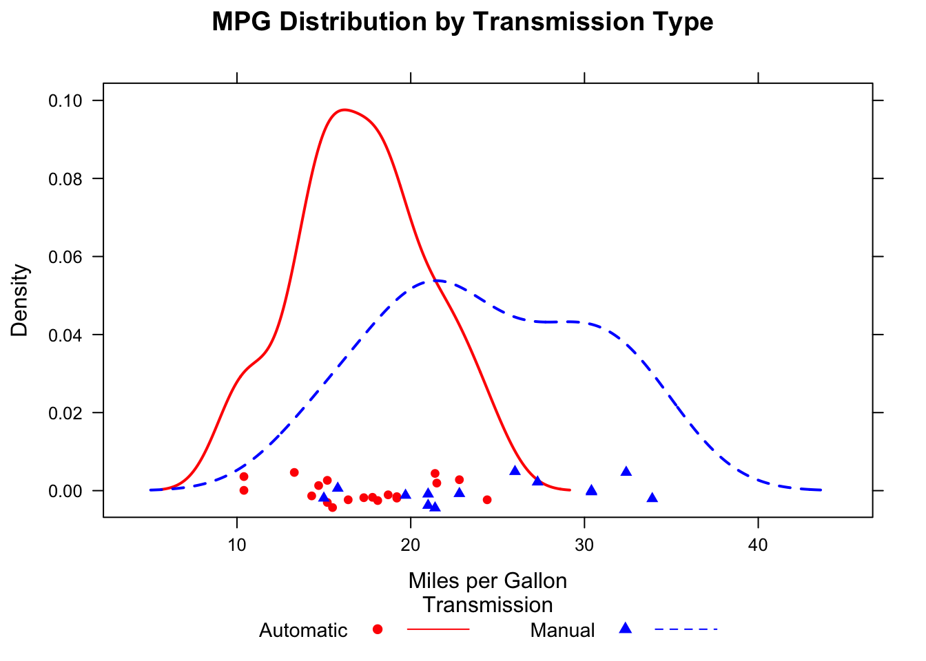
让我们使用R自带的CO2数据集讨论一下在单个图中包含分组和调节变量的例子。
这个数据集描述了12种植物在7种二氧化碳浓度下的二氧化碳吸收率。6种植物来自魁北克,6种来自密西西比。每个产地有3种植物在冷藏条件下研究,3种在非冷藏条件下研究。在该例子中,plant是分组变量,Type和Treatment是调节变量。
library(lattice)
colors <- "darkgreen"
symbols <- c(1:12)
linetypes <- c(1:3)
key.species <- list(title="Plant",
                    space = "right",
                    text = list(levels(CO2$Plant)),
                    points = list(pch=symbols, col=colors))
xyplot(uptake~conc|Type*Treatment, data=CO2,
       group=Plant,
       type="o",
       pch=symbols, col=colors, lty=linetypes,
       main = "Carbon Dioxide Uptake\nin Grass Plants",
       ylab = "Uptake",
       xlab = "Concentration",
       sub = "Grass Species: Echinochloa crus-galli",
       key = key.species)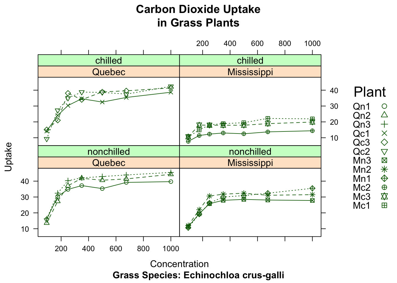
图形参数
lattice图形不受par()函数的影响,它使用的默认设置在一个大的列表对象中,可以通过trellis.par.get()函数获得并通过trellis.par.set()函数更改。我们可以使用show.settings()函数来直观地展示当前的图形设置。
查看默认设置:
show.settings()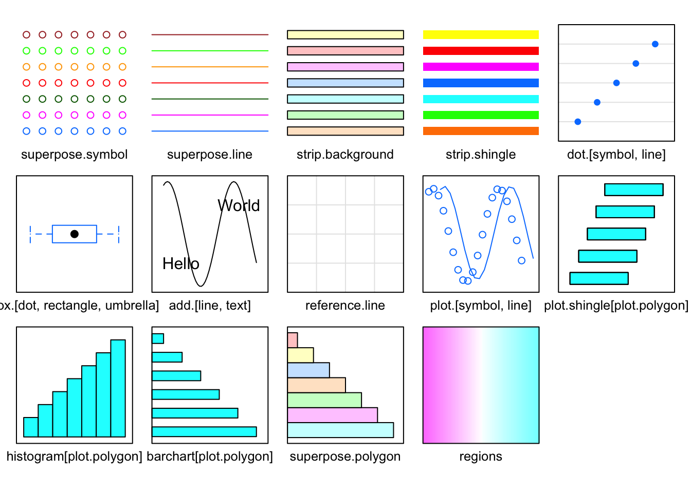
将它们保存到列表:
mysettings <- trellis.par.get()可以使用names()查看列表成分:
names(mysettings)
#>  [1] "grid.pars"         "fontsize"          "background"
#>  [4] "panel.background"  "clip"              "add.line"
#>  [7] "add.text"          "plot.polygon"      "box.dot"
#> [10] "box.rectangle"     "box.umbrella"      "dot.line"
#> [13] "dot.symbol"        "plot.line"         "plot.symbol"
#> [16] "reference.line"    "strip.background"  "strip.shingle"
#> [19] "strip.border"      "superpose.line"    "superpose.symbol"
#> [22] "superpose.polygon" "regions"           "shade.colors"
#> [25] "axis.line"         "axis.text"         "axis.components"
#> [28] "layout.heights"    "layout.widths"     "box.3d"
#> [31] "par.xlab.text"     "par.ylab.text"     "par.zlab.text"
#> [34] "par.main.text"     "par.sub.text"
修改:
mysettings$superpose.symbol$pch <- c(1:10)
trellis.par.set(mysettings)
查看更改:
show.settings()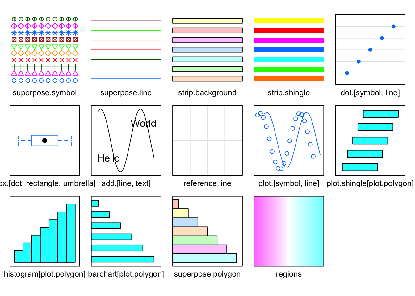
自定义图形条带
面板条带默认的背景是:第一个调节变量时桃红色,第二个调节变量时浅绿色,第三个调节变量的浅蓝色。我们可以使用上一节描述的方法;或是加强控制,写一个自定义条带各方面的函数。
library(lattice)
histogram(~height | voice.part, data = singer,
          strip = strip.custom(bg="lightgrey",
                               par.strip.text = list(color="black", cex=.8, font=3)),
          main = "Distribution of Heights by Voice Pitch",
          xlab = "Height (inches)")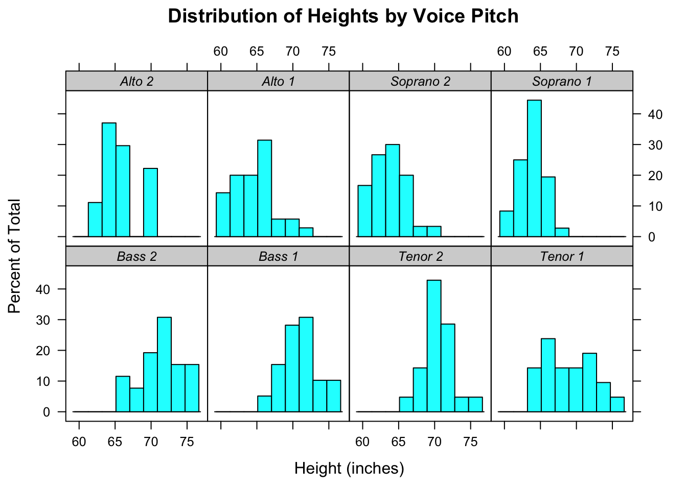
option=选项用来指定设定条带外观的函数,尽管我们可以从头写一个函数(参见?strip.default),但是改变一些设置并使用其他项的默认值更简单。strip.custom()函数可以帮助我们实现。bg选项控制了背景颜色,par.strip.text允许我们控制条带文本的外观。font选项可以分别取数值1、2、3、4,代表正常字体、粗体、斜体和粗斜体。
页面布局
split选项将一个页面分成指定数量的行和列,并把图放到结果矩阵的特定单元格。split选项的格式是:
split = c(x, y, nx, ny)也就是在包括nx乘以ny个图形的数组中,把当前图形放在x,y的位置,图形的起始位置是在左上角。
library(lattice)
graph1 <- histogram(~height | voice.part, data = singer,
                    main = "Height of Choral Singers by Voice Part")
graph2 <- bwplot(height~voice.part, data = singer)
plot(graph1, split = c(1, 1, 1, 2))
plot(graph2, split = c(1, 2, 1, 2), newpage = FALSE)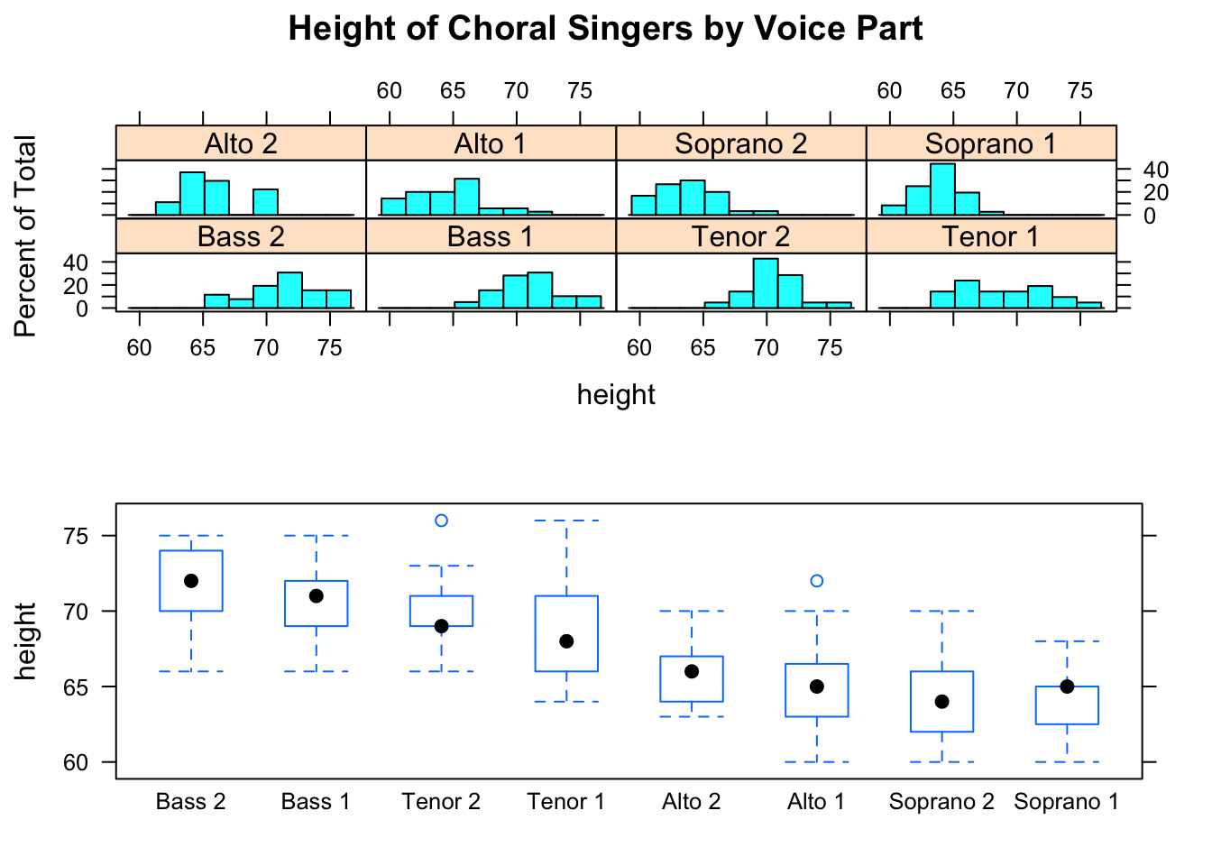
我们可以更好的控制尺寸:
plot(graph1, position = c(0, .3, 1, 1))
plot(graph2, position = c(0, 0, 1, .3), newpage = FALSE)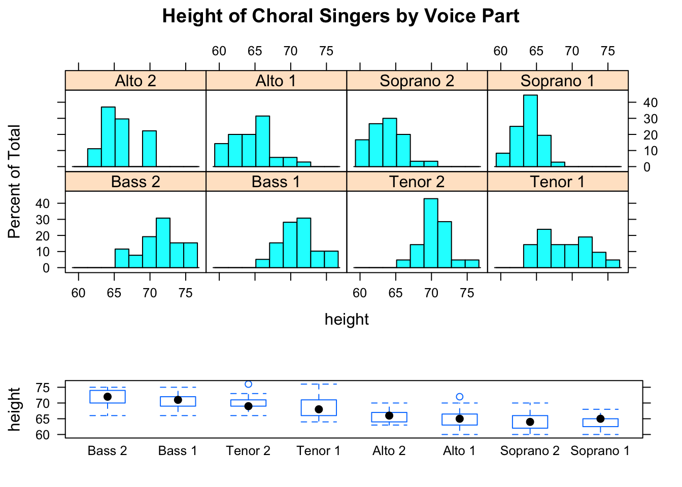
这里的position=c(xmin, ymin, xmax, ymax)选项中,页面的坐标系是x轴和y轴都从0到1的矩形,原点在左下角的(0,0)。
我们还可以控制面板的顺序
histogram(~height | voice.part, data = singer,
          index.cond = list(c(2, 4, 6, 8, 1, 3, 5, 7)))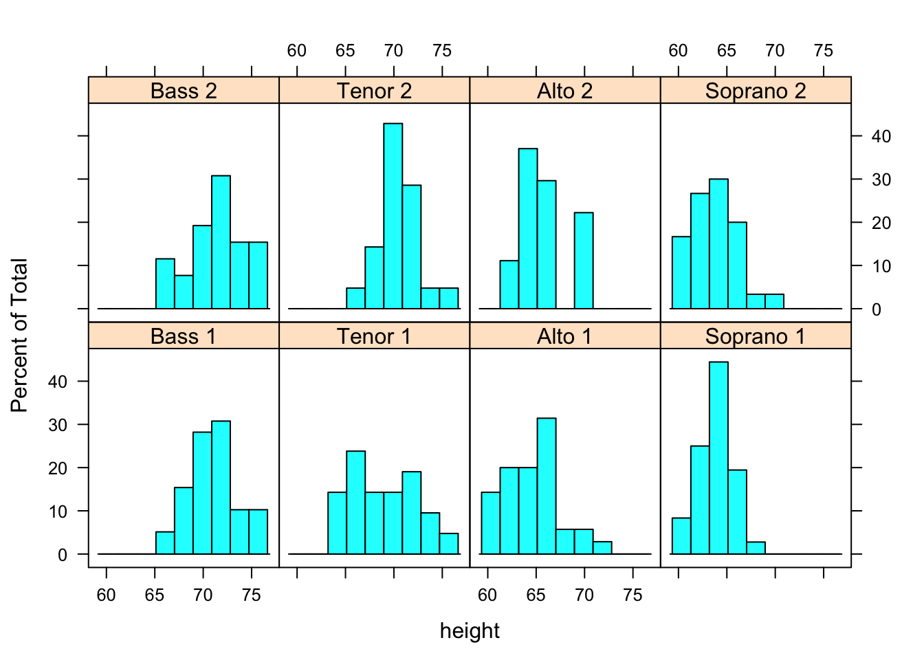
深入学习
Deepayan Sarkar 的“Lattice Graphics: An Introduction”(http://mng.bz/jXUG, 2008)和Willian G.Jacoby的“An Introduction to Lattice Graphics in R” (http://mng.bz/v4TO, 2010)