R 表格可视化 10+ 指南
王诗翔 · 2020-10-29
原文:https://themockup.blog/posts/2020-09-04-10-table-rules-in-r/ Rmd
本文根据原文翻译而成,根据实际运行测试和理解进行修改。
表格和图的区别:
- 表格:一般用来查询和比较单独的值,精确地展示数据。
- 图:一般用来反应数据集的关系和整体的形状。
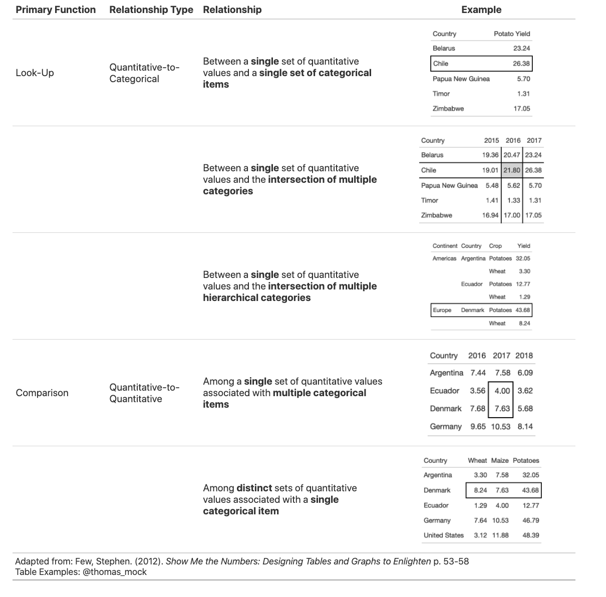
表格用途分类
根据下图展示的用途分类选择是否需要使用表格:
gt:表格语法
gt 是一个 R 包,它能够通过表格语法将表格数据转换为一个表格!
除了 gt 包,还有以下一些有用的表格相关 R 包:
kableExtra- 处理 HTML/LaTex 非常好。formattable- 处理 HTML 自定义单元格填充非常好。DT或reactable处理响应表(常用于 RMarkdown 和 Shiny)。flextable- 处理 Word 基于的表格。gtsummary- 有用的gt拓展包。
以下是表格语法:

读取和预处理数据
library(tidyverse)
#> ── Attaching packages ─────────────────────────────────────── tidyverse 1.3.0 ──
#> ✓ ggplot2 3.3.2     ✓ purrr   0.3.4
#> ✓ tibble  3.0.4     ✓ dplyr   1.0.2
#> ✓ tidyr   1.1.2     ✓ stringr 1.4.0
#> ✓ readr   1.4.0     ✓ forcats 0.5.0
#> ── Conflicts ────────────────────────────────────────── tidyverse_conflicts() ──
#> x dplyr::filter() masks stats::filter()
#> x dplyr::lag()    masks stats::lag()
library(gt)

key_crop_yields <- read_csv("../../../static/datasets/key_crop_yields.csv.gz", col_types = cols())

yield_data <- key_crop_yields %>%
  janitor::clean_names() %>%
  rename_with(~ str_remove(., "_tonnes_per_hectare")) %>%
  filter(!is.na(code)) %>%
  select(entity:beans, -code) %>%
  pivot_longer(cols = wheat:beans, names_to = "crop", values_to = "yield") %>%
  rename(Country = entity)

country_sel <- c("China", "India", "United States", "Indonesia", "Mexico", "Pakistan")

yield_data_wide <- key_crop_yields %>%
  janitor::clean_names() %>%
  rename_with(~ str_remove(., "_tonnes_per_hectare")) %>%
  select(entity:beans, -code) %>%
  pivot_longer(cols = wheat:beans, names_to = "crop", values_to = "yield") %>%
  rename(Country = entity) %>%
  filter(
    crop %in% c("potatoes", "maize"),
    year %in% c(2014:2016),
    Country %in% country_sel
  ) %>%
  pivot_wider(names_from = year, values_from = yield)
基础 gt 表
你可以通过向 gt() 传递数据来创建表,其思想是通过管道逐步向 gt 表添加层或更改。
# This works!
# gt(yield_data_wide)

# pipe also works!
yield_data_wide %>%
gt()| Country | crop | 2014 | 2015 | 2016 |
|---|---|---|---|---|
| China | maize | 5.81 | 5.89 | 5.97 |
| China | potatoes | 17.14 | 17.27 | 17.69 |
| India | maize | 2.61 | 2.60 | 2.62 |
| India | potatoes | 22.92 | 23.13 | 20.51 |
| Indonesia | maize | 4.95 | 5.18 | 5.31 |
| Indonesia | potatoes | 17.67 | 18.20 | 18.25 |
| Mexico | maize | 3.30 | 3.48 | 3.72 |
| Mexico | potatoes | 27.34 | 27.14 | 27.93 |
| Pakistan | maize | 4.32 | 4.42 | 4.55 |
| Pakistan | potatoes | 18.15 | 23.44 | 22.43 |
| United States | maize | 10.73 | 10.57 | 11.74 |
| United States | potatoes | 47.15 | 46.90 | 48.64 |
添加组别
我们可以通过传入一个分组 tibble 将一个表分成不同的组别:
yield_data_wide %>%
  head() %>%
  group_by(Country) %>% # respects grouping from dplyr
gt(rowname_col = "crop")| 2014 | 2015 | 2016 | |
|---|---|---|---|
| China | |||
| maize | 5.81 | 5.89 | 5.97 |
| potatoes | 17.14 | 17.27 | 17.69 |
| India | |||
| maize | 2.61 | 2.60 | 2.62 |
| potatoes | 22.92 | 23.13 | 20.51 |
| Indonesia | |||
| maize | 4.95 | 5.18 | 5.31 |
| potatoes | 17.67 | 18.20 | 18.25 |
或者直接通过参数显式指定:
yield_data_wide %>%
  head() %>%
  gt(
    groupname_col = "crop",
    rowname_col = "Country"
)| 2014 | 2015 | 2016 | |
|---|---|---|---|
| maize | |||
| China | 5.81 | 5.89 | 5.97 |
| India | 2.61 | 2.60 | 2.62 |
| Indonesia | 4.95 | 5.18 | 5.31 |
| potatoes | |||
| China | 17.14 | 17.27 | 17.69 |
| India | 22.92 | 23.13 | 20.51 |
| Indonesia | 17.67 | 18.20 | 18.25 |
分组也对成组汇总行非常有用。
# fmt_number() 用来设定浮点数

yield_data_wide %>%
  mutate(crop = str_to_title(crop)) %>%
  group_by(crop) %>%
  gt(
    rowname_col = "Country"
  ) %>%
  fmt_number(
    columns = 2:5, # 按位置指定列
    decimals = 2 # 降低浮点数位
  ) %>%
  summary_rows(
    groups = TRUE,
    columns = vars(`2014`, `2015`, `2016`), # 按名字指定列
    fns = list(
      avg = ~ mean(.), # 添加任意多的汇总
      sd = ~ sd(.)
    )
)| 2014 | 2015 | 2016 | |
|---|---|---|---|
| Maize | |||
| China | 5.81 | 5.89 | 5.97 |
| India | 2.61 | 2.60 | 2.62 |
| Indonesia | 4.95 | 5.18 | 5.31 |
| Mexico | 3.30 | 3.48 | 3.72 |
| Pakistan | 4.32 | 4.42 | 4.55 |
| United States | 10.73 | 10.57 | 11.74 |
| avg | 5.29 | 5.36 | 5.65 |
| sd | 2.90 | 2.81 | 3.21 |
| Potatoes | |||
| China | 17.14 | 17.27 | 17.69 |
| India | 22.92 | 23.13 | 20.51 |
| Indonesia | 17.67 | 18.20 | 18.25 |
| Mexico | 27.34 | 27.14 | 27.93 |
| Pakistan | 18.15 | 23.44 | 22.43 |
| United States | 47.15 | 46.90 | 48.64 |
| avg | 25.06 | 26.01 | 25.91 |
| sd | 11.51 | 10.86 | 11.73 |
添加跨列修饰
直接使用 tab_spanner()。
yield_data_wide %>%
  head() %>%
  gt(
    groupname_col = "crop",
    rowname_col = "Country"
  ) %>%
  tab_spanner(
    label = "Yield in Tonnes/Hectare",
    columns = 2:5
)| Yield in Tonnes/Hectare | |||
|---|---|---|---|
| 2014 | 2015 | 2016 | |
| maize | |||
| China | 5.81 | 5.89 | 5.97 |
| India | 2.61 | 2.60 | 2.62 |
| Indonesia | 4.95 | 5.18 | 5.31 |
| potatoes | |||
| China | 17.14 | 17.27 | 17.69 |
| India | 22.92 | 23.13 | 20.51 |
| Indonesia | 17.67 | 18.20 | 18.25 |
添加注释和标题
tab_footnote() 用来添加脚注。注意下面我们使用 locations 参数标记要修饰的表格列,而这里并不是指在数据中的位置(2:5),另外我们还可以使用 vars(name)(类似上面) 设定。
yield_data_wide %>%
  head() %>%
  gt(
    groupname_col = "crop",
    rowname_col = "Country"
  ) %>%
  tab_footnote(
    footnote = "Yield in Tonnes/Hectare",
    locations = cells_column_labels(
      columns = 1:3 # note
    )
)| 20141 | 20151 | 20161 | |
|---|---|---|---|
| maize | |||
| China | 5.81 | 5.89 | 5.97 |
| India | 2.61 | 2.60 | 2.62 |
| Indonesia | 4.95 | 5.18 | 5.31 |
| potatoes | |||
| China | 17.14 | 17.27 | 17.69 |
| India | 22.92 | 23.13 | 20.51 |
| Indonesia | 17.67 | 18.20 | 18.25 |
|
1
Yield in Tonnes/Hectare
|
|||
添加来源注释:
yield_data_wide %>%
  head() %>%
  gt(
    groupname_col = "crop",
    rowname_col = "Country"
  ) %>%
  tab_footnote(
    footnote = "Yield in Tonnes/Hectare",
    locations = cells_column_labels(
      columns = 1:3 # note
    )
  ) %>%
tab_source_note(source_note = "Data: OurWorldInData")| 20141 | 20151 | 20161 | |
|---|---|---|---|
| maize | |||
| China | 5.81 | 5.89 | 5.97 |
| India | 2.61 | 2.60 | 2.62 |
| Indonesia | 4.95 | 5.18 | 5.31 |
| potatoes | |||
| China | 17.14 | 17.27 | 17.69 |
| India | 22.92 | 23.13 | 20.51 |
| Indonesia | 17.67 | 18.20 | 18.25 |
| Data: OurWorldInData | |||
|
1
Yield in Tonnes/Hectare
|
|||
使用 tab_header() 为表格添加标题,利用 md() 或 html() 对文字进行修饰。
yield_data_wide %>%
  head() %>%
  gt(
    groupname_col = "crop",
    rowname_col = "Country"
  ) %>%
  tab_header(
    title = md("**Crop Yields between 2014 and 2016**"),
    subtitle = html("<em>Countries limited to Asia</em>")
)| Crop Yields between 2014 and 2016 | |||
|---|---|---|---|
| Countries limited to Asia | |||
| 2014 | 2015 | 2016 | |
| maize | |||
| China | 5.81 | 5.89 | 5.97 |
| India | 2.61 | 2.60 | 2.62 |
| Indonesia | 4.95 | 5.18 | 5.31 |
| potatoes | |||
| China | 17.14 | 17.27 | 17.69 |
| India | 22.92 | 23.13 | 20.51 |
| Indonesia | 17.67 | 18.20 | 18.25 |
修改展示
我们可以利用 tab_options() 自定义表格外观。所有支持的设定请阅读文档。
yield_data_wide %>%
  head() %>%
  gt(
    groupname_col = "crop",
    rowname_col = "Country"
  ) %>%
  tab_header(
    title = "Crop Yields between 2014 and 2016",
    subtitle = "Countries limited to Asia"
  ) %>%
  tab_options(
    heading.subtitle.font.size = 12,
    heading.align = "left",
    table.border.top.color = "black",
    column_labels.border.bottom.color = "black",
    column_labels.border.bottom.width = px(3),
)| Crop Yields between 2014 and 2016 | |||
|---|---|---|---|
| Countries limited to Asia | |||
| 2014 | 2015 | 2016 | |
| maize | |||
| China | 5.81 | 5.89 | 5.97 |
| India | 2.61 | 2.60 | 2.62 |
| Indonesia | 4.95 | 5.18 | 5.31 |
| potatoes | |||
| China | 17.14 | 17.27 | 17.69 |
| India | 22.92 | 23.13 | 20.51 |
| Indonesia | 17.67 | 18.20 | 18.25 |
由于 gt 的管道特性,我们可以像 ggplot2 一样设置主题。
my_theme <- function(data) {
  tab_options(
    data = data,
    heading.subtitle.font.size = 12,
    heading.align = "left",
    table.border.top.color = "black",
    column_labels.border.bottom.color = "black",
    column_labels.border.bottom.width = px(3),
  )
}

yield_data_wide %>%
  head() %>%
  gt(
    groupname_col = "crop",
    rowname_col = "Country"
  ) %>%
  tab_header(
    title = "Crop Yields between 2014 and 2016",
    subtitle = "Countries limited to Asia"
  ) %>%
my_theme()| Crop Yields between 2014 and 2016 | |||
|---|---|---|---|
| Countries limited to Asia | |||
| 2014 | 2015 | 2016 | |
| maize | |||
| China | 5.81 | 5.89 | 5.97 |
| India | 2.61 | 2.60 | 2.62 |
| Indonesia | 4.95 | 5.18 | 5.31 |
| potatoes | |||
| China | 17.14 | 17.27 | 17.69 |
| India | 22.92 | 23.13 | 20.51 |
| Indonesia | 17.67 | 18.20 | 18.25 |
通过 tab_style() 我们可以设定特定单元格的风格。
yield_data_wide %>%
  head() %>%
  gt() %>%
  tab_style(
    style = list(
      cell_text(weight = "bold")
    ),
    locations = cells_column_labels(everything())
  ) %>%
  tab_style(
    style = list(
      cell_fill(color = "black", alpha = 0.2),
      cell_borders(
        side = c("left", "right"),
        color = "black",
        weight = px(2)
      )
    ),
    locations = cells_body(
      columns = vars(crop)
    )
  ) %>%
  tab_style(
    style = list(
      cell_text(color = "red", style = "italic")
    ),
    locations = cells_body(
      columns = 3:5,
      rows = Country == "China"
    )
)| Country | crop | 2014 | 2015 | 2016 |
|---|---|---|---|---|
| China | maize | 5.81 | 5.89 | 5.97 |
| China | potatoes | 17.14 | 17.27 | 17.69 |
| India | maize | 2.61 | 2.60 | 2.62 |
| India | potatoes | 22.92 | 23.13 | 20.51 |
| Indonesia | maize | 4.95 | 5.18 | 5.31 |
| Indonesia | potatoes | 17.67 | 18.20 | 18.25 |
利用 data_color() 和 scales::col_numeric() 设定连续的数据颜色。
yield_data_wide %>%
  head() %>%
  gt(
    groupname_col = "crop",
    rowname_col = "Country"
  ) %>%
  data_color(
    columns = vars(`2014`, `2015`, `2016`),
    colors = scales::col_numeric(
      paletteer::paletteer_d(
        palette = "ggsci::red_material"
      ) %>% as.character(),
      domain = NULL
    )
)| 2014 | 2015 | 2016 | |
|---|---|---|---|
| maize | |||
| China | 5.81 | 5.89 | 5.97 |
| India | 2.61 | 2.60 | 2.62 |
| Indonesia | 4.95 | 5.18 | 5.31 |
| potatoes | |||
| China | 17.14 | 17.27 | 17.69 |
| India | 22.92 | 23.13 | 20.51 |
| Indonesia | 17.67 | 18.20 | 18.25 |
也可以自定义调色板:
yield_data_wide %>%
  head() %>%
  gt(
    groupname_col = "crop",
    rowname_col = "Country"
  ) %>%
  data_color(
    columns = vars(`2014`, `2015`, `2016`),
    colors = scales::col_numeric(
      c("white", "pink", "red"),
      domain = NULL
    )
)| 2014 | 2015 | 2016 | |
|---|---|---|---|
| maize | |||
| China | 5.81 | 5.89 | 5.97 |
| India | 2.61 | 2.60 | 2.62 |
| Indonesia | 4.95 | 5.18 | 5.31 |
| potatoes | |||
| China | 17.14 | 17.27 | 17.69 |
| India | 22.92 | 23.13 | 20.51 |
| Indonesia | 17.67 | 18.20 | 18.25 |
gt 会自动修改文字的颜色以增强对比度,通过
autocolor_text = FALSE关闭该特性。
以上就是 gt 基础了,接下来我们会学习更深刻的表格优化指南。
gt 10+ 指南
规则 1:将表头和内容分开
这里的目标是将列标题与表的主体清晰地分开。一般利用粗体、分隔线将类别/标签(列标题)和值(表体)区分开来。
先准备一个示例数据:
potato_data <- yield_data %>%
  filter(Country %in% country_sel, crop == "potatoes", year %in% c(2013:2016)) %>%
  filter(crop == "potatoes") %>%
pivot_wider(names_from = year, values_from = "yield")- 糟糕的例子
potato_tb <- potato_data %>%
  gt() %>%
  cols_hide(vars(crop)) %>%
  opt_table_lines(extent = "none") %>%
  fmt_number(
    columns = 3:6,
    decimals = 2
  )
potato_tb| Country | 2013 | 2014 | 2015 | 2016 |
|---|---|---|---|---|
| China | 17.09 | 17.14 | 17.27 | 17.69 |
| India | 22.76 | 22.92 | 23.13 | 20.51 |
| Indonesia | 16.02 | 17.67 | 18.20 | 18.25 |
| Mexico | 26.78 | 27.34 | 27.14 | 27.93 |
| Pakistan | 21.81 | 18.15 | 23.44 | 22.43 |
| United States | 46.36 | 47.15 | 46.90 | 48.64 |
修改后的例子:
rule1_good <- potato_tb %>%
  tab_style(
    style = list(
      cell_text(weight = "bold")
    ),
    locations = cells_column_labels(everything())
  ) %>%
  opt_table_lines(extent = "default") %>%
  tab_options(
    column_labels.border.top.color = "white",
    column_labels.border.top.width = px(3),
    column_labels.border.bottom.color = "black",
    table_body.hlines.color = "white",
    table.border.bottom.color = "white",
    table.border.bottom.width = px(3)
  ) %>%
  tab_source_note(md("**Table**: @thomas_mock | **Data**: OurWorldInData.org<br>**Inspiration**: @jschwabish"))

rule1_good| Country | 2013 | 2014 | 2015 | 2016 |
|---|---|---|---|---|
| China | 17.09 | 17.14 | 17.27 | 17.69 |
| India | 22.76 | 22.92 | 23.13 | 20.51 |
| Indonesia | 16.02 | 17.67 | 18.20 | 18.25 |
| Mexico | 26.78 | 27.34 | 27.14 | 27.93 |
| Pakistan | 21.81 | 18.15 | 23.44 | 22.43 |
| United States | 46.36 | 47.15 | 46.90 | 48.64 |
| Table: @thomas_mock | Data: OurWorldInData.org Inspiration: @jschwabish |
||||
规则 2:使用细微的分隔线而不是粗网格线
这里的意思是,你需要在必要时清楚地标出分割线。特别是对于许多列标签,你需要确保结构中的更改是清晰的。
准备数据:
rule2_data <- yield_data %>%
  filter(Country %in% country_sel, crop == "potatoes", year %in% c(2007:2016)) %>%
  filter(crop == "potatoes") %>%
  select(-crop) %>%
  pivot_wider(names_from = year, values_from = "yield") %>%
  rowwise() %>%
  mutate(
    avg_07_11 = mean(`2007`:`2011`),
    .before = `2012`
  ) %>%
  mutate(
    avg_12_16 = mean(`2012`:`2016`)
  ) %>%
ungroup()- 糟糕的例子
rule2_tab1 <- rule2_data %>%
  gt(
    rowname_col = "Country"
  ) %>%
  cols_label(
    avg_07_11 = "Avg.",
    avg_12_16 = "Avg."
  ) %>%
  cols_width(
    1 ~ px(125)
  ) %>%
  fmt_number(
    columns = 2:last_col()
  ) %>%
  tab_style(
    style = cell_borders(
      side = "all",
      color = "grey",
      weight = px(1),
      style = "solid"
    ),
    locations = list(
      cells_body(
        everything()
      ),
      cells_column_labels(
        everything()
      )
    )
  ) %>%
  grand_summary_rows(
    columns = 2:last_col(),
    fns = list(
      "Average" = ~ mean(.)
    ),
    formatter = fmt_number
  )

rule2_tab1| 2007 | 2008 | 2009 | 2010 | 2011 | Avg. | 2012 | 2013 | 2014 | 2015 | 2016 | Avg. | |
|---|---|---|---|---|---|---|---|---|---|---|---|---|
| China | 14.63 | 15.18 | 14.42 | 15.67 | 16.28 | 15.13 | 16.77 | 17.09 | 17.14 | 17.27 | 17.69 | 16.77 |
| India | 16.41 | 19.30 | 18.81 | 19.93 | 22.72 | 19.41 | 21.75 | 22.76 | 22.92 | 23.13 | 20.51 | 21.25 |
| Indonesia | 16.09 | 16.67 | 16.51 | 15.94 | 15.96 | 16.09 | 16.58 | 16.02 | 17.67 | 18.20 | 18.25 | 17.08 |
| Mexico | 27.06 | 27.73 | 27.74 | 27.76 | 26.27 | 27.06 | 26.81 | 26.78 | 27.34 | 27.14 | 27.93 | 27.31 |
| Pakistan | 19.35 | 16.46 | 20.28 | 22.68 | 21.92 | 20.35 | 18.34 | 21.81 | 18.15 | 23.44 | 22.43 | 20.34 |
| United States | 44.43 | 44.44 | 46.44 | 44.94 | 44.69 | 44.43 | 45.78 | 46.36 | 47.15 | 46.90 | 48.64 | 46.78 |
| Average | 23.00 | 23.29 | 24.03 | 24.49 | 24.64 | 23.75 | 24.34 | 25.13 | 25.06 | 26.01 | 25.91 | 24.92 |
上面这个表格你可能注意到了最下放针对每一年的均值数据,但表格中间的均值信息你会很容易忽略。
- 修改后的例子
在下面的修改例子中,我们将表头与内容分开,将数据汇总与单个数据记录分析,并强调有可能会忽略的列。
rule2_tab2 <- rule2_data %>%
  add_row(
    rule2_data %>%
      summarize(
        across(where(is.double),
          list(Average = mean),
          .names = "{col}"
        )
      ) %>%
      mutate(Country = "Average")
  ) %>%
  gt() %>%
  cols_label(
    avg_07_11 = "Avg.",
    avg_12_16 = "Avg."
  ) %>%
  fmt_number(
    columns = 2:last_col()
  ) %>%
  tab_style(
    style = cell_fill(
      color = "lightgrey"
    ),
    locations = list(
      cells_body(
        columns = vars(avg_07_11, avg_12_16)
      ),
      cells_column_labels(
        columns = vars(avg_07_11, avg_12_16)
      )
    )
  ) %>%
  tab_style(
    style = cell_borders(
      sides = "top",
      color = "black",
      weight = px(2)
    ),
    locations = cells_body(
      columns = everything(),
      rows = Country == "Average"
    )
  ) %>%
  tab_style(
    style = list(
      cell_text(weight = "bold")
    ),
    locations = cells_column_labels(everything())
  ) %>%
  tab_options(
    column_labels.border.top.color = "black",
    column_labels.border.top.width = px(3),
    column_labels.border.bottom.color = "black"
  )

rule2_tab2 %>%
tab_source_note(md("**Table**: @thomas_mock | **Data**: OurWorldInData.org<br>**Inspiration**:@jschwabish"))| Country | 2007 | 2008 | 2009 | 2010 | 2011 | Avg. | 2012 | 2013 | 2014 | 2015 | 2016 | Avg. |
|---|---|---|---|---|---|---|---|---|---|---|---|---|
| China | 14.63 | 15.18 | 14.42 | 15.67 | 16.28 | 15.13 | 16.77 | 17.09 | 17.14 | 17.27 | 17.69 | 16.77 |
| India | 16.41 | 19.30 | 18.81 | 19.93 | 22.72 | 19.41 | 21.75 | 22.76 | 22.92 | 23.13 | 20.51 | 21.25 |
| Indonesia | 16.09 | 16.67 | 16.51 | 15.94 | 15.96 | 16.09 | 16.58 | 16.02 | 17.67 | 18.20 | 18.25 | 17.08 |
| Mexico | 27.06 | 27.73 | 27.74 | 27.76 | 26.27 | 27.06 | 26.81 | 26.78 | 27.34 | 27.14 | 27.93 | 27.31 |
| Pakistan | 19.35 | 16.46 | 20.28 | 22.68 | 21.92 | 20.35 | 18.34 | 21.81 | 18.15 | 23.44 | 22.43 | 20.34 |
| United States | 44.43 | 44.44 | 46.44 | 44.94 | 44.69 | 44.43 | 45.78 | 46.36 | 47.15 | 46.90 | 48.64 | 46.78 |
| Average | 23.00 | 23.29 | 24.03 | 24.49 | 24.64 | 23.75 | 24.34 | 25.13 | 25.06 | 26.01 | 25.91 | 24.92 |
| Table: @thomas_mock | Data: OurWorldInData.org Inspiration:@jschwabish |
||||||||||||
规则 3:将数字和表头右对齐
在这种情况下,我们希望将数字右对齐,理想情况下选择单间距或数字对齐字体,同时避免使用“旧风格”字体,这些字体的数字垂直位置不同。重要的是,在大多数情况下,gt已经自动地遵循了最佳实践,所以我们必须改变一些默认设置来获得糟糕的示例。
生成数据:
rule3_data <- yield_data %>%
  filter(Country == "United States", year %in% c(2016)) %>%
  mutate(crop = str_to_title(crop)) %>%
  pivot_wider(names_from = year, values_from = "yield") %>%
  arrange(crop) %>%
  select(-Country, Crop = crop)
注意下面生成的表格中左对齐和居中对齐都让我们很难比较数据的小数位。
rule3_align <- rule3_data %>%
  mutate(
    `Center align` = `2016`,
    `Right align` = `2016`
  ) %>%
  rename(`Left align` = 2) %>%
  gt() %>%
  tab_style(
    style = list(
      cell_text(weight = "bold")
    ),
    locations = cells_column_labels(everything())
  ) %>%
  fmt_number(
    columns = 2:4
  ) %>%
  cols_align(
    align = "left",
    columns = 2
  ) %>%
  cols_align(
    align = "center",
    columns = 3
  ) %>%
  cols_align(
    align = "right",
    columns = 4
  ) %>%
  tab_options(
    column_labels.border.top.color = "white",
    column_labels.border.top.width = px(3),
    column_labels.border.bottom.color = "black",
    table_body.hlines.color = "white",
    table.border.bottom.color = "white",
    table.border.bottom.width = px(3)
  )

rule3_align
| Crop | Left align | Center align | Right align |
|---|---|---|---|
| Beans | 2.06 | 2.06 | 2.06 |
| Maize | 11.74 | 11.74 | 11.74 |
| Potatoes | 48.64 | 48.64 | 48.64 |
| Rice | 8.11 | 8.11 | 8.11 |
| Soybeans | 3.49 | 3.49 | 3.49 |
| Wheat | 3.54 | 3.54 | 3.54 |
生成数据:
rule3_data_addendum <- yield_data %>%
  filter(
    Country %in% c("China"),
    year >= 2015,
    str_length(crop) == 5
  ) %>%
  group_by(year) %>%
  mutate(
    crop = str_to_title(crop),
    max_yield = max(yield),
    `Top Crop` = if_else(yield == max_yield, "Y", "N")
  ) %>%
  select(Year = year, Crop = crop, `Top Crop`, Yield = yield) %>%
  ungroup()

# 将上表对比下 gt() 默认的对齐方式
rule3_data_addendum %>%
gt()| Year | Crop | Top Crop | Yield |
|---|---|---|---|
| 2015 | Wheat | N | 5.39 |
| 2015 | Maize | Y | 5.89 |
| 2015 | Beans | N | 1.65 |
| 2016 | Wheat | N | 5.40 |
| 2016 | Maize | Y | 5.97 |
| 2016 | Beans | N | 1.64 |
| 2017 | Wheat | N | 5.48 |
| 2017 | Maize | Y | 6.11 |
| 2017 | Beans | N | 1.76 |
| 2018 | Wheat | N | 5.42 |
| 2018 | Maize | Y | 6.10 |
| 2018 | Beans | N | 1.78 |
请注意,由于默认的左对齐,顶部的 Crop 列在右边有太多的空白。这会使它过多地“粘”在相邻栏上。
我们可以通过居中对齐解决这一问题:
rule3_data_addendum %>%
  gt() %>%
  gt::cols_align(
    align = "center",
    columns = vars(`Top Crop`, Crop)
)| Year | Crop | Top Crop | Yield |
|---|---|---|---|
| 2015 | Wheat | N | 5.39 |
| 2015 | Maize | Y | 5.89 |
| 2015 | Beans | N | 1.65 |
| 2016 | Wheat | N | 5.40 |
| 2016 | Maize | Y | 5.97 |
| 2016 | Beans | N | 1.64 |
| 2017 | Wheat | N | 5.48 |
| 2017 | Maize | Y | 6.11 |
| 2017 | Beans | N | 1.76 |
| 2018 | Wheat | N | 5.42 |
| 2018 | Maize | Y | 6.10 |
| 2018 | Beans | N | 1.78 |
另外,请注意 pivot_wider() 也可以改进这个表的展示,减少 Crop 和 Top Crop 的重复。同样,居中对齐有助于 Top Crop 列。
rule3_data_addendum %>%
  pivot_wider(names_from = Year, values_from = Yield) %>%
  gt() %>%
  gt::cols_align(
    align = "center",
    columns = vars(`Top Crop`)
)| Crop | Top Crop | 2015 | 2016 | 2017 | 2018 |
|---|---|---|---|---|---|
| Wheat | N | 5.39 | 5.40 | 5.48 | 5.42 |
| Maize | Y | 5.89 | 5.97 | 6.11 | 6.10 |
| Beans | N | 1.65 | 1.64 | 1.76 | 1.78 |
细心选择字体。
对于下面的字体,请注意,默认的 gt 字体和等宽字体 Fira Mono 有很好的对齐的小数数位和等间距的数字。相比之下,Karla、Cabin 和 Georgia 在数字/小数水平和垂直对齐方面存在问题。我们在数字上加了下划线,所以你可以看到 Georgia 的垂直间隔问题。
rule3_text <- rule3_data %>%
  mutate(
    Karla = `2016`,
    Cabin = `2016`,
    Georgia = `2016`,
    `Fira Mono` = `2016`
  ) %>%
  rename(Default = 2) %>%
  gt() %>%
  tab_style(
    style = list(
      cell_text(font = "Default", decorate = "underline")
    ),
    locations = list(
      cells_column_labels(
        vars(Default)
      ),
      cells_body(
        vars(Default)
      )
    )
  ) %>%
  tab_style(
    style = list(
      cell_text(font = "Karla", decorate = "underline")
    ),
    locations = list(
      cells_column_labels(
        vars(Karla)
      ),
      cells_body(
        vars(Karla)
      )
    )
  ) %>%
  tab_style(
    style = list(
      cell_text(font = "Cabin", decorate = "underline")
    ),
    locations = list(
      cells_column_labels(
        vars(Cabin)
      ),
      cells_body(
        vars(Cabin)
      )
    )
  ) %>%
  tab_style(
    style = list(
      cell_text(font = "Georgia", decorate = "underline")
    ),
    locations = list(
      cells_column_labels(
        vars(Georgia)
      ),
      cells_body(
        vars(Georgia)
      )
    )
  ) %>%
  tab_style(
    style = list(
      cell_text(font = "Fira Mono", decorate = "underline")
    ),
    locations = list(
      cells_column_labels(
        vars(`Fira Mono`)
      ),
      cells_body(
        vars(`Fira Mono`)
      )
    )
  ) %>%
  fmt_number(columns = 2:6) %>%
  tab_spanner(
    label = "Good",
    columns = c(2, 6)
  ) %>%
  tab_spanner(
    "Bad",
    3:5
  ) %>%
  tab_options(
    column_labels.border.top.color = "white",
    column_labels.border.top.width = px(3),
    column_labels.border.bottom.color = "black",
    table_body.hlines.color = "white",
    table.border.bottom.color = "white",
    table.border.bottom.width = px(3)
  )

rule3_text| Crop | Good | Bad | |||
|---|---|---|---|---|---|
| Default | Fira Mono | Karla | Cabin | Georgia | |
| Beans | 2.06 | 2.06 | 2.06 | 2.06 | 2.06 |
| Maize | 11.74 | 11.74 | 11.74 | 11.74 | 11.74 |
| Potatoes | 48.64 | 48.64 | 48.64 | 48.64 | 48.64 |
| Rice | 8.11 | 8.11 | 8.11 | 8.11 | 8.11 |
| Soybeans | 3.49 | 3.49 | 3.49 | 3.49 | 3.49 |
| Wheat | 3.54 | 3.54 | 3.54 | 3.54 | 3.54 |
规则 4:左对齐文字和标题
对于标签/字符串,左对齐通常更合适。这允许你的眼睛在一个清晰的边界垂直跟随短的和长的文本来扫描一个表格。
country_names <- c(
  "British Virgin Islands",
  "Cayman Islands",
  "Democratic Republic of Congo",
  "Luxembourg",
  "United States",
  "Germany",
  "New Zealand",
  "Costa Rica",
  "Peru"
)

rule4_tab_left <- tibble(
  right = country_names,
  center = country_names,
  left = country_names
) %>%
  gt() %>%
  cols_align(
    align = "left",
    columns = 3
  ) %>%
  cols_align(
    align = "center",
    columns = 2
  ) %>%
  cols_align(
    align = "right",
    columns = 1
  ) %>%
  cols_width(
    everything() ~ px(250)
  ) %>%
  tab_options(
    column_labels.border.top.color = "white",
    column_labels.border.top.width = px(3),
    column_labels.border.bottom.color = "black",
    column_labels.font.weight = "bold",
    table_body.hlines.color = "white",
    table.border.bottom.color = "white",
    table.border.bottom.width = px(3),
    data_row.padding = px(3)
  ) %>%
  cols_label(
    right = md("Right aligned and<br>hard to read"),
    center = md("Centered and<br>even harder to read"),
    left = md("Left-aligned and<br>easiest to read")
  ) %>%
  tab_source_note(md("**Table**: @thomas_mock | **Data**: OurWorldInData.org<br>**Inspiration**: @jschwabish"))

rule4_tab_left| Right aligned and hard to read |
Centered and even harder to read |
Left-aligned and easiest to read |
|---|---|---|
| British Virgin Islands | British Virgin Islands | British Virgin Islands |
| Cayman Islands | Cayman Islands | Cayman Islands |
| Democratic Republic of Congo | Democratic Republic of Congo | Democratic Republic of Congo |
| Luxembourg | Luxembourg | Luxembourg |
| United States | United States | United States |
| Germany | Germany | Germany |
| New Zealand | New Zealand | New Zealand |
| Costa Rica | Costa Rica | Costa Rica |
| Peru | Peru | Peru |
| Table: @thomas_mock | Data: OurWorldInData.org Inspiration: @jschwabish |
||
规则 5:选择合适的数值精度
虽然我们有时可以调整增加小数位数,但通常 1 或 2 位可以帮助改善表的外观。
rule5_tab <- yield_data %>%
  filter(Country %in% country_sel, crop == "potatoes", year %in% c(2016)) %>%
  select(Country, yield) %>%
  mutate(few = yield, right = yield) %>%
  gt() %>%
  fmt_number(
    columns = vars(yield),
    decimals = 4
  ) %>%
  fmt_number(
    columns = vars(few),
    decimals = 0
  ) %>%
  fmt_number(
    columns = vars(right),
    decimals = 1
  ) %>%
  cols_label(
    yield = md("Too many<br>decimals"),
    few = md("Too few<br>decimals"),
    right = md("About<br>right")
  ) %>%
  tab_source_note(md("**Table**: @thomas_mock | **Data**: OurWorldInData.org<br>**Inspiration**: @jschwabish"))

rule5_tab| Country | Too many decimals |
Too few decimals |
About right |
|---|---|---|---|
| China | 17.6866 | 18 | 17.7 |
| India | 20.5087 | 21 | 20.5 |
| Indonesia | 18.2549 | 18 | 18.3 |
| Mexico | 27.9260 | 28 | 27.9 |
| Pakistan | 22.4346 | 22 | 22.4 |
| United States | 48.6408 | 49 | 48.6 |
| Table: @thomas_mock | Data: OurWorldInData.org Inspiration: @jschwabish |
|||
规则 6:用行和列之间的空间引导读者
虽然间隔是一门艺术,但想想你该如何引导读者。你想让它容易地水平或垂直移动阅读取决于表的目的。此外,增加间距可以提高表格的整体可读性,尽管太多的空间会分散注意力。
rule6_data <- yield_data %>%
  filter(Country %in% country_sel, crop == "potatoes", year %in% c(2014:2016)) %>%
  filter(crop == "potatoes") %>%
  pivot_wider(names_from = year, values_from = "yield") %>%
  select(-crop)

rule6_tb <- rule6_data %>%
  add_row(
    rule6_data %>%
      summarize(
        across(where(is.double),
          list(Average = mean),
          .names = "{col}"
        )
      ) %>%
      mutate(Country = "Average")
  ) %>%
  gt() %>%
  fmt_number(
    columns = 2:4,
    decimals = 2
  ) %>%
  tab_style(
    style = list(
      cell_text(weight = "bold")
    ),
    locations = cells_column_labels(everything())
  ) %>%
  tab_style(
    style = cell_borders(
      sides = "top",
      color = "black",
      weight = px(2)
    ),
    locations = cells_body(
      columns = everything(),
      rows = Country == "Average"
    )
  ) %>%
  tab_options(
    column_labels.border.top.color = "white",
    column_labels.border.top.width = px(3),
    column_labels.border.bottom.color = "black",
    table_body.hlines.color = "white",
    table.border.bottom.color = "white",
    table.border.bottom.width = px(3)
  ) %>%
  cols_width(
    vars(Country) ~ px(125),
    2:4 ~ px(75)
  )

rule6_tb| Country | 2014 | 2015 | 2016 |
|---|---|---|---|
| China | 17.14 | 17.27 | 17.69 |
| India | 22.92 | 23.13 | 20.51 |
| Indonesia | 17.67 | 18.20 | 18.25 |
| Mexico | 27.34 | 27.14 | 27.93 |
| Pakistan | 18.15 | 23.44 | 22.43 |
| United States | 47.15 | 46.90 | 48.64 |
| Average | 25.06 | 26.01 | 25.91 |
规则 7:移除单元重复
这里的目标是消除重复单元,以提高可读性和增加表中的信噪比。对于我们的示例,我们将在第一次出现之后删除 % 号。虽然这对于行开头的货币符号来说很容易做到,但是末尾的 % 符号会改变单元格的对齐方式。gt实际上有一个开放的 Github Issue 来讨论这个特性,但与此同时,我有两个策略来完成这个 % 技巧,如下所示。
先看下普通情况下生成的表格:
rule6_tb %>%
  fmt_percent(
    columns = 2:4,
    rows = 1,
    scale_values = FALSE
)| Country | 2014 | 2015 | 2016 |
|---|---|---|---|
| China | 17.14% | 17.27% | 17.69% |
| India | 22.92 | 23.13 | 20.51 |
| Indonesia | 17.67 | 18.20 | 18.25 |
| Mexico | 27.34 | 27.14 | 27.93 |
| Pakistan | 18.15 | 23.44 | 22.43 |
| United States | 47.15 | 46.90 | 48.64 |
| Average | 25.06 | 26.01 | 25.91 |
我们可以尝试为所有有相同范围的单元格左对齐),因为数字将正确对齐,尽管单位的变化可以再次混乱对齐。
rule6_tb %>%
  fmt_percent(
    columns = 2:4,
    rows = 1,
    scale_values = FALSE
  ) %>%
  cols_align(
    columns = 2:4,
    align = "left"
  )
| Country | 2014 | 2015 | 2016 |
|---|---|---|---|
| China | 17.14% | 17.27% | 17.69% |
| India | 22.92 | 23.13 | 20.51 |
| Indonesia | 17.67 | 18.20 | 18.25 |
| Mexico | 27.34 | 27.14 | 27.93 |
| Pakistan | 18.15 | 23.44 | 22.43 |
| United States | 47.15 | 46.90 | 48.64 |
| Average | 25.06 | 26.01 | 25.91 |
rule6_tb %>%
  fmt_percent(
    columns = 2:4,
    rows = 1,
    scale_values = FALSE,
    placement = "left"
)| Country | 2014 | 2015 | 2016 |
|---|---|---|---|
| China | %17.14 | %17.27 | %17.69 |
| India | 22.92 | 23.13 | 20.51 |
| Indonesia | 17.67 | 18.20 | 18.25 |
| Mexico | 27.34 | 27.14 | 27.93 |
| Pakistan | 18.15 | 23.44 | 22.43 |
| United States | 47.15 | 46.90 | 48.64 |
| Average | 25.06 | 26.01 | 25.91 |
您总是可以在每个列标签中添加 % 号,这样就可以清楚地看到列实际上是百分比,而不是原始数字。
rule6_tb %>%
  cols_label(
    `2014` = "2014 (%)",
    `2015` = "2015 (%)",
    `2016` = "2016 (%)"
  ) %>%
  cols_width(
    2:4 ~ px(100)
)| Country | 2014 (%) | 2015 (%) | 2016 (%) |
|---|---|---|---|
| China | 17.14 | 17.27 | 17.69 |
| India | 22.92 | 23.13 | 20.51 |
| Indonesia | 17.67 | 18.20 | 18.25 |
| Mexico | 27.34 | 27.14 | 27.93 |
| Pakistan | 18.15 | 23.44 | 22.43 |
| United States | 47.15 | 46.90 | 48.64 |
| Average | 25.06 | 26.01 | 25.91 |
译者觉得这是最舒服的一种方式。
或者添加一个跨列栏。
rule6_tb %>%
  tab_spanner(
    label = md("**% Yield of Total**"),
    columns = 2:4
)| Country | % Yield of Total | ||
|---|---|---|---|
| 2014 | 2015 | 2016 | |
| China | 17.14 | 17.27 | 17.69 |
| India | 22.92 | 23.13 | 20.51 |
| Indonesia | 17.67 | 18.20 | 18.25 |
| Mexico | 27.34 | 27.14 | 27.93 |
| Pakistan | 18.15 | 23.44 | 22.43 |
| United States | 47.15 | 46.90 | 48.64 |
| Average | 25.06 | 26.01 | 25.91 |
最后,你也可以添加脚注来显示该信息。
rule6_tb %>%
  tab_footnote(
    footnote = md("**% Yield of Total**"),
    locations = cells_column_labels(2:4)
)| Country | 20141 | 20151 | 20161 |
|---|---|---|---|
| China | 17.14 | 17.27 | 17.69 |
| India | 22.92 | 23.13 | 20.51 |
| Indonesia | 17.67 | 18.20 | 18.25 |
| Mexico | 27.34 | 27.14 | 27.93 |
| Pakistan | 18.15 | 23.44 | 22.43 |
| United States | 47.15 | 46.90 | 48.64 |
| Average | 25.06 | 26.01 | 25.91 |
|
1
% Yield of Total
|
|||
规则 8:高亮离群值
先构造数据:
rule8_data <- yield_data %>%
  filter(Country %in% country_sel, crop == "potatoes", year %in% 2009:2017) %>%
  group_by(Country) %>%
  mutate(pct_change = (yield / lag(yield) - 1) * 100) %>%
  ungroup() %>%
  filter(between(year, 2010, 2016)) %>%
  select(Country, year, pct_change) %>%
  pivot_wider(names_from = year, values_from = pct_change)
先看普通的表格展示:
rule8_tb <- rule8_data %>%
  gt() %>%
  fmt_number(2:last_col()) %>%
  cols_label(
    Country = ""
  ) %>%
  tab_style(
    style = list(
      cell_text(weight = "bold")
    ),
    locations = cells_column_labels(everything())
  ) %>%
  tab_options(
    column_labels.border.top.color = "white",
    column_labels.border.top.width = px(3),
    column_labels.border.bottom.color = "black",
    column_labels.border.bottom.width = px(3),
    table_body.hlines.color = "white",
    table.border.bottom.color = "black",
    table.border.bottom.width = px(3)
  ) %>%
  cols_width(
    vars(Country) ~ px(125),
    2:last_col() ~ px(75)
  )

rule8_tb| 2010 | 2011 | 2012 | 2013 | 2014 | 2015 | 2016 | |
|---|---|---|---|---|---|---|---|
| China | 8.68 | 3.92 | 3.00 | 1.91 | 0.30 | 0.74 | 2.42 |
| India | 5.95 | 14.02 | −4.27 | 4.63 | 0.71 | 0.89 | −11.32 |
| Indonesia | −3.44 | 0.07 | 3.92 | −3.40 | 10.29 | 3.03 | 0.29 |
| Mexico | 0.07 | −5.35 | 2.04 | −0.13 | 2.10 | −0.71 | 2.88 |
| Pakistan | 11.82 | −3.36 | −16.33 | 18.89 | −16.76 | 29.16 | −4.31 |
| United States | −3.23 | −0.56 | 2.43 | 1.27 | 1.71 | −0.53 | 3.71 |
我们把负值高亮出来:
rule8_color <- rule8_tb %>%
  tab_style(
    style = cell_text(color = "red"),
    locations = list(
      cells_body(
        columns = 2,
        rows = `2010` < 0
      ),
      cells_body(
        columns = 3,
        rows = `2011` < 0
      ),
      cells_body(
        columns = 4,
        rows = `2012` < 0
      ),
      cells_body(
        columns = 5,
        rows = `2013` < 0
      ),
      cells_body(
        columns = 6,
        rows = `2014` < 0
      ),
      cells_body(
        columns = 7,
        rows = `2015` < 0
      ),
      cells_body(
        columns = 8,
        rows = `2016` < 0
      )
    )
  )

rule8_color| 2010 | 2011 | 2012 | 2013 | 2014 | 2015 | 2016 | |
|---|---|---|---|---|---|---|---|
| China | 8.68 | 3.92 | 3.00 | 1.91 | 0.30 | 0.74 | 2.42 |
| India | 5.95 | 14.02 | −4.27 | 4.63 | 0.71 | 0.89 | −11.32 |
| Indonesia | −3.44 | 0.07 | 3.92 | −3.40 | 10.29 | 3.03 | 0.29 |
| Mexico | 0.07 | −5.35 | 2.04 | −0.13 | 2.10 | −0.71 | 2.88 |
| Pakistan | 11.82 | −3.36 | −16.33 | 18.89 | −16.76 | 29.16 | −4.31 |
| United States | −3.23 | −0.56 | 2.43 | 1.27 | 1.71 | −0.53 | 3.71 |
另外我们可以对背景颜色进行填充。
rule8_fill <- rule8_tb %>%
  tab_style(
    style = list(
      cell_fill(color = scales::alpha("red", 0.7)),
      cell_text(color = "white", weight = "bold")
    ),
    locations = list(
      cells_body(
        columns = 2,
        rows = `2010` < 0
      ),
      cells_body(
        columns = 3,
        rows = `2011` < 0
      ),
      cells_body(
        columns = 4,
        rows = `2012` < 0
      ),
      cells_body(
        columns = 5,
        rows = `2013` < 0
      ),
      cells_body(
        columns = 6,
        rows = `2014` < 0
      ),
      cells_body(
        columns = 7,
        rows = `2015` < 0
      ),
      cells_body(
        columns = 8,
        rows = `2016` < 0
      )
    )
  )

rule8_fill| 2010 | 2011 | 2012 | 2013 | 2014 | 2015 | 2016 | |
|---|---|---|---|---|---|---|---|
| China | 8.68 | 3.92 | 3.00 | 1.91 | 0.30 | 0.74 | 2.42 |
| India | 5.95 | 14.02 | −4.27 | 4.63 | 0.71 | 0.89 | −11.32 |
| Indonesia | −3.44 | 0.07 | 3.92 | −3.40 | 10.29 | 3.03 | 0.29 |
| Mexico | 0.07 | −5.35 | 2.04 | −0.13 | 2.10 | −0.71 | 2.88 |
| Pakistan | 11.82 | −3.36 | −16.33 | 18.89 | −16.76 | 29.16 | −4.31 |
| United States | −3.23 | −0.56 | 2.43 | 1.27 | 1.71 | −0.53 | 3.71 |
规则 9:将相似的数据分组并增加空白
在这个规则中,我们希望确保对类似的类别进行分组,以便更容易地解析表。我们还可以增加空白,甚至删除重复。
先构造数据:
rule9_data <- yield_data %>%
  filter(
    Country %in% country_sel[-5], year %in% c(2015, 2016),
    crop %in% c("wheat", "potatoes", "rice", "soybeans"),
    !is.na(yield)
  ) %>%
  pivot_wider(names_from = year, values_from = yield) %>%
  rowwise() %>%
  mutate(
    crop = str_to_title(crop),
    pct_change = (`2016` / `2015` - 1) * 100
  ) %>%
  group_by(Country) %>%
  arrange(desc(`2015`)) %>%
  ungroup()
不好的例子
rule9_bad <- rule9_data %>%
  gt() %>%
  fmt_number(
    columns = vars(`2015`, `2016`, pct_change)
  ) %>%
  tab_spanner(
    columns = vars(`2015`, `2016`),
    label = md("**Yield in Tonnes/Hectare**")
  ) %>%
  cols_width(
    vars(crop) ~ px(125),
    vars(`2015`, `2016`, pct_change) ~ 100
  )

rule9_bad| Country | crop | Yield in Tonnes/Hectare | pct_change | |
|---|---|---|---|---|
| 2015 | 2016 | |||
| United States | Potatoes | 46.90 | 48.64 | 3.71 |
| Pakistan | Potatoes | 23.44 | 22.43 | −4.31 |
| India | Potatoes | 23.13 | 20.51 | −11.32 |
| Indonesia | Potatoes | 18.20 | 18.25 | 0.29 |
| China | Potatoes | 17.27 | 17.69 | 2.42 |
| United States | Rice | 8.37 | 8.11 | −3.11 |
| China | Rice | 6.89 | 6.86 | −0.44 |
| China | Wheat | 5.39 | 5.40 | 0.07 |
| Indonesia | Rice | 5.34 | 5.24 | −1.97 |
| Pakistan | Rice | 3.72 | 3.77 | 1.28 |
| India | Rice | 3.61 | 3.79 | 5.06 |
| United States | Soybeans | 3.23 | 3.49 | 8.20 |
| United States | Wheat | 2.93 | 3.54 | 20.85 |
| India | Wheat | 2.75 | 3.03 | 10.34 |
| Pakistan | Wheat | 2.73 | 2.78 | 1.96 |
| China | Soybeans | 1.81 | 1.80 | −0.46 |
| Indonesia | Soybeans | 1.57 | 1.49 | −5.04 |
| India | Soybeans | 0.73 | 1.18 | 60.27 |
| Pakistan | Soybeans | 0.54 | 0.85 | 58.61 |
gt 提供了按行分组,我们可以使用它来区分不同国家。
rule9_grp <- rule9_data %>%
  gt(groupname_col = "Country") %>%
  tab_stubhead("label") %>%
  tab_options(
    table.width = px(300)
  ) %>%
  cols_label(
    crop = "",
    pct_change = md("Percent<br>Change")
  ) %>%
  fmt_number(
    columns = vars(`2015`, `2016`, pct_change)
  ) %>%
  tab_style(
    style = cell_text(color = "black", weight = "bold"),
    locations = list(
      cells_row_groups(),
      cells_column_labels(everything())
    )
  ) %>%
  tab_spanner(
    columns = vars(`2015`, `2016`),
    label = md("**Yield in Tonnes/Hectare**")
  ) %>%
  cols_width(
    vars(crop) ~ px(125),
    vars(`2015`, `2016`, pct_change) ~ 100
  ) %>%
  tab_options(
    row_group.border.top.width = px(3),
    row_group.border.top.color = "black",
    row_group.border.bottom.color = "black",
    table_body.hlines.color = "white",
    table.border.top.color = "white",
    table.border.top.width = px(3),
    table.border.bottom.color = "white",
    table.border.bottom.width = px(3),
    column_labels.border.bottom.color = "black",
    column_labels.border.bottom.width = px(2)
  ) %>%
  tab_source_note(md("**Table**: @thomas_mock | **Data**: OurWorldInData.org<br>**Inspiration**: @jschwabish"))

rule9_grp| Yield in Tonnes/Hectare | Percent Change |
||
|---|---|---|---|
| 2015 | 2016 | ||
| United States | |||
| Potatoes | 46.90 | 48.64 | 3.71 |
| Rice | 8.37 | 8.11 | −3.11 |
| Soybeans | 3.23 | 3.49 | 8.20 |
| Wheat | 2.93 | 3.54 | 20.85 |
| Pakistan | |||
| Potatoes | 23.44 | 22.43 | −4.31 |
| Rice | 3.72 | 3.77 | 1.28 |
| Wheat | 2.73 | 2.78 | 1.96 |
| Soybeans | 0.54 | 0.85 | 58.61 |
| India | |||
| Potatoes | 23.13 | 20.51 | −11.32 |
| Rice | 3.61 | 3.79 | 5.06 |
| Wheat | 2.75 | 3.03 | 10.34 |
| Soybeans | 0.73 | 1.18 | 60.27 |
| Indonesia | |||
| Potatoes | 18.20 | 18.25 | 0.29 |
| Rice | 5.34 | 5.24 | −1.97 |
| Soybeans | 1.57 | 1.49 | −5.04 |
| China | |||
| Potatoes | 17.27 | 17.69 | 2.42 |
| Rice | 6.89 | 6.86 | −0.44 |
| Wheat | 5.39 | 5.40 | 0.07 |
| Soybeans | 1.81 | 1.80 | −0.46 |
| Table: @thomas_mock | Data: OurWorldInData.org Inspiration: @jschwabish |
|||
或者,我们可以删除一些观察值以创建更多的空白。这里我们完全依赖于留白,而不是水平分隔符。我们可以使用 gt::text_transform() 来保存我们数据中的所有观察结果,但不在 gt 表中显示国家的重复。
rule9_dup <- rule9_data %>%
  arrange(Country) %>%
  gt() %>%
  cols_label(
    Country = "",
    crop = "Crop",
    pct_change = md("Percent<br>Change")
  ) %>%
  tab_spanner(
    columns = vars(`2015`, `2016`),
    label = md("**Yield in Tonnes/Hectare**")
  ) %>%
  fmt_number(
    columns = vars(`2015`, `2016`, pct_change)
  ) %>%
  text_transform(
    locations = cells_body(
      columns = vars(Country),
      rows = crop != "Potatoes"
    ),
    fn = function(x) {
      paste0("")
    }
  ) %>%
  tab_style(
    style = cell_text(color = "black", weight = "bold"),
    locations = list(
      cells_row_groups(),
      cells_column_labels(everything())
    )
  ) %>%
  cols_width(
    vars(Country, crop) ~ px(125),
    vars(`2015`, `2016`, pct_change) ~ 100
  ) %>%
  tab_options(
    column_labels.border.bottom.color = "black",
    column_labels.border.bottom.width = px(2),
    table_body.hlines.color = "white",
    table.border.top.color = "white",
    table.border.top.width = px(3),
    table.border.bottom.color = "white",
    table.border.bottom.width = px(3),
  ) %>%
  tab_source_note(md("**Table**: @thomas_mock | **Data**: OurWorldInData.org<br>**Inspiration**: @jschwabish"))

rule9_dup| Crop | Yield in Tonnes/Hectare | Percent Change |
||
|---|---|---|---|---|
| 2015 | 2016 | |||
| China | Potatoes | 17.27 | 17.69 | 2.42 |
| Rice | 6.89 | 6.86 | −0.44 | |
| Wheat | 5.39 | 5.40 | 0.07 | |
| Soybeans | 1.81 | 1.80 | −0.46 | |
| India | Potatoes | 23.13 | 20.51 | −11.32 |
| Rice | 3.61 | 3.79 | 5.06 | |
| Wheat | 2.75 | 3.03 | 10.34 | |
| Soybeans | 0.73 | 1.18 | 60.27 | |
| Indonesia | Potatoes | 18.20 | 18.25 | 0.29 |
| Rice | 5.34 | 5.24 | −1.97 | |
| Soybeans | 1.57 | 1.49 | −5.04 | |
| Pakistan | Potatoes | 23.44 | 22.43 | −4.31 |
| Rice | 3.72 | 3.77 | 1.28 | |
| Wheat | 2.73 | 2.78 | 1.96 | |
| Soybeans | 0.54 | 0.85 | 58.61 | |
| United States | Potatoes | 46.90 | 48.64 | 3.71 |
| Rice | 8.37 | 8.11 | −3.11 | |
| Soybeans | 3.23 | 3.49 | 8.20 | |
| Wheat | 2.93 | 3.54 | 20.85 | |
| Table: @thomas_mock | Data: OurWorldInData.org Inspiration: @jschwabish |
||||
规则 10:当适合时添加可视化
虽然数据可视化和表格是不同的工具,但我们可以以更聪明的方式组合它们,以进一步吸引读者。嵌入式数据可视化可以显示趋势,而表本身则显示用于查找的原始数据。
生成数据:
rule10_data <- yield_data %>%
  filter(
    year %in% c(2013, 2017),
    crop == "potatoes",
    Country %in% c(
      country_sel, "Germany", "Brazil", "Ireland", "Lebanon", "Italy",
      "Netherlands", "France", "Denmark", "El Salvador", "Denmark"
    )
  ) %>%
pivot_wider(names_from = year, values_from = yield)- 火花线图
例如,我们可以使用火花线来表示跨越时间的趋势。下面有相当多的代码,我们实际上使用了两个数据集。由于我们在 gt 之外创建火花线,请确保将图形+数据对齐,因为 gt 不控制整体关系。例如,如果按特定列 arrange() ,需要确保跨两个数据集执行此操作。
plot_spark <- function(data) {
  data %>%
    mutate(
      yield_start = if_else(year == 2013, yield, NA_real_),
      yield_end = if_else(year == 2017, yield, NA_real_)
    ) %>%
    tidyr::fill(yield_start, yield_end, .direction = "downup") %>%
    mutate(color = if_else(yield_end - yield_start < 0, "red", "blue")) %>%
    ggplot(aes(x = year, y = yield, color = color)) +
    geom_line(size = 15) +
    theme_void() +
    scale_color_identity() +
    theme(legend.position = "none")
}

# SPARKLINE

yield_plots <- yield_data %>%
  filter(
    year %in% c(2013:2017),
    crop == "potatoes",
    Country %in% c(
      country_sel, "Germany", "Brazil", "Ireland", "Lebanon", "Italy",
      "Netherlands", "France", "Denmark", "El Salvador", "Denmark"
    )
  ) %>%
  nest(yields = c(year, yield)) %>%
  mutate(plot = map(yields, plot_spark))

# SPARKLINES PLOT

rule10_spark <- rule10_data %>%
  mutate(ggplot = NA) %>%
  select(-crop) %>%
  gt() %>%
  text_transform(
    locations = cells_body(vars(ggplot)),
    fn = function(x) {
      map(yield_plots$plot, ggplot_image, height = px(15), aspect_ratio = 4)
    }
  ) %>%
  cols_width(vars(ggplot) ~ px(100)) %>%
  cols_label(
    ggplot = "2013-2017"
  ) %>%
  fmt_number(2:3) %>%
  tab_spanner(
    label = "Potato Yield in Tonnes/Hectare",
    columns = c(2, 3)
  ) %>%
  tab_style(
    style = cell_text(color = "black", weight = "bold"),
    locations = list(
      cells_column_spanners(everything()),
      cells_column_labels(everything())
    )
  ) %>%
  tab_options(
    row_group.border.top.width = px(3),
    row_group.border.top.color = "black",
    row_group.border.bottom.color = "black",
    table_body.hlines.color = "white",
    table.border.top.color = "white",
    table.border.top.width = px(3),
    table.border.bottom.color = "white",
    table.border.bottom.width = px(3),
    column_labels.border.bottom.color = "black",
    column_labels.border.bottom.width = px(2),
  ) %>%
  tab_source_note(md("**Table**: @thomas_mock | **Data**: OurWorldInData.org<br>**Inspiration**: @jschwabish"))

rule10_spark
| Country | Potato Yield in Tonnes/Hectare | 2013-2017 | |
|---|---|---|---|
| 2013 | 2017 | ||
| Brazil | 27.75 | 30.94 |  |
| China | 17.09 | 18.21 |  |
| Denmark | 41.57 | 43.68 |  |
| El Salvador | 42.60 | 29.22 |  |
| France | 43.16 | 44.05 |  |
| Germany | 39.83 | 46.79 |  |
| India | 22.76 | 22.31 |  |
| Indonesia | 16.02 | 15.40 |  |
| Ireland | 38.33 | 44.83 |  |
| Italy | 25.25 | 27.73 |  |
| Lebanon | 26.08 | 25.14 |  |
| Mexico | 26.78 | 28.95 |  |
| Netherlands | 42.21 | 45.97 |  |
| Pakistan | 21.81 | 21.45 |  |
| United States | 46.36 | 48.39 |  |
| Table: @thomas_mock | Data: OurWorldInData.org Inspiration: @jschwabish |
|||
对于本例,我们可以使用柱状图来表示 5 年的平均值。请注意,我们不需要为每一行构建 ggplot,而是可以从 formattable R 包通过一些函数仅使用 HTML/CSS 创建一列。下面有相当多的代码,但是请注意,gt包要求使用 gt:: HTML() 解析 HTML。总的来说,这种方法比通过 ggplot 更“干净”,因为我们是在同一个数据集中改变列,而且它更快,因为我们只是解析 HTML,而不是创建、保存和导入几个 ggplot 图像。非常感谢 formattable 作者 Renkun Kun 和 rtjohnson12 等人,他们展示了如何使用 HTML 构建柱状图的示例!还感谢 Christophe Dervieux 在 RStudio 社区提供了一个极好的 gt +自定义 HTML 示例。
# Example of using glue to just paste the value into pre-created HTML block
# Example adapted from rtjohnson12 at:
# https://github.com/renkun-ken/formattable/issues/79#issuecomment-573165954
bar_chart <- function(value, color = "red", display_value = NULL) {
# Choose to display percent of total
if (is.null(display_value)) {
display_value <- " "
} else {
display_value <- display_value
}
# paste color and value into the html string
glue::glue("<span style=\"display: inline-block; direction: ltr; border-radius: 4px; padding-right: 2px; background-color: {color}; color: {color}; width: {value}%\"> {display_value} </span>")
}
# create a color palette w/ paletteer
# note you could just pass a single color directly to the bar_chart function
col_pal <- function(value) {
# set high and low
domain_range <- range(c(rule10_data$`2013`, rule10_data$`2017`))
# create the color based of domain
scales::col_numeric(
paletteer::paletteer_d("ggsci::blue_material") %>% as.character(),
domain = c(min(value), max(value))
)(value)
}
# BARPLOT
bar_yields <- yield_data %>%
filter(
year %in% c(2013:2017),
crop == "potatoes",
Country %in% c(
country_sel, "Germany", "Brazil", "Ireland", "Lebanon", "Italy",
"Netherlands", "France", "Denmark", "El Salvador", "Denmark"
)
) %>%
pivot_wider(names_from = year, values_from = yield) %>%
select(-crop) %>%
rowwise() %>%
mutate(
mean = mean(c(`2013`, `2014`, `2015`, `2016`, `2017`))
) %>%
ungroup() %>%
select(Country, `2013`, `2017`, `mean`) %>%
mutate(
bar = round(mean / max(mean) * 100, digits = 2),
color = col_pal(bar),
bar_chart = bar_chart(bar, color = color),
bar_chart = map(bar_chart, ~ gt::html(as.character(.x)))
) %>%
select(-bar, -color)
# BARPLOT
rule10_bar <- bar_yields %>%
gt() %>%
cols_width(
vars(bar_chart) ~ px(100),
vars(`2013`) ~ px(75),
vars(`2017`) ~ px(75)
) %>%
cols_label(
mean = md("Average<br>2013-17"),
bar_chart = ""
) %>%
cols_align(
align = "right",
columns = 2:4
) %>%
cols_align(
align = "left",
columns = vars(bar_chart)
) %>%
fmt_number(2:4) %>%
tab_style(
style = cell_text(color = "black", weight = "bold"),
locations = list(
cells_column_labels(everything())
)
) %>%
tab_options(
row_group.border.top.width = px(3),
row_group.border.top.color = "black",
row_group.border.bottom.color = "black",
table_body.hlines.color = "white",
table.border.top.color = "white",
table.border.top.width = px(3),
table.border.bottom.color = "white",
table.border.bottom.width = px(3),
table_body.border.bottom.width = px(2),
table_body.border.bottom.color = "black",
column_labels.border.bottom.color = "black",
column_labels.border.bottom.width = px(3)
) %>%
tab_footnote(
footnote = "Potato Yield in Tonnes per Hectare",
locations = cells_column_labels(
columns = 2:4
)
) %>%
tab_source_note(md("**Table**: @thomas_mock | **Data**: OurWorldInData.org<br>**Inspiration**: @jschwabish"))
rule10_bar
| Country | 20131 | 20171 | Average 2013-171 |
|
|---|---|---|---|---|
| Brazil | 27.75 | 30.94 | 29.12 | |
| China | 17.09 | 18.21 | 17.48 | |
| Denmark | 41.57 | 43.68 | 42.45 | |
| El Salvador | 42.60 | 29.22 | 29.92 | |
| France | 43.16 | 44.05 | 43.30 | |
| Germany | 39.83 | 46.79 | 44.45 | |
| India | 22.76 | 22.31 | 22.32 | |
| Indonesia | 16.02 | 15.40 | 17.11 | |
| Ireland | 38.33 | 44.83 | 40.99 | |
| Italy | 25.25 | 27.73 | 26.93 | |
| Lebanon | 26.08 | 25.14 | 25.27 | |
| Mexico | 26.78 | 28.95 | 27.63 | |
| Netherlands | 42.21 | 45.97 | 43.71 | |
| Pakistan | 21.81 | 21.45 | 21.46 | |
| United States | 46.36 | 48.39 | 47.49 | |
| Table: @thomas_mock | Data: OurWorldInData.org Inspiration: @jschwabish |
||||
|
1
Potato Yield in Tonnes per Hectare
|
||||
最后,我们可以在整个图中添加颜色,以显示不同时间和国家的数据趋势。
rule10_wide <- yield_data %>%
  filter(
    year %in% c(2013:2017),
    crop == "potatoes",
    Country %in% c(
      country_sel, "Germany", "Brazil", "Ireland", "Lebanon", "Italy",
      "Netherlands", "France", "Denmark", "El Salvador", "Denmark"
    )
  ) %>%
  pivot_wider(names_from = year, values_from = yield)

rule10_heat <- rule10_wide %>%
  arrange(desc(`2013`)) %>%
  select(-crop) %>%
  gt() %>%
  data_color(
    columns = 2:6,
    colors = scales::col_numeric(
      palette = paletteer::paletteer_d(
        palette = "ggsci::blue_material"
      ) %>% as.character(),
      domain = NULL
    )
  ) %>%
  fmt_number(2:6) %>%
  tab_spanner(
    label = "Potato Yield in Tonnes/Hectare",
    columns = c(2:6)
  ) %>%
  tab_style(
    style = cell_text(color = "black", weight = "bold"),
    locations = list(
      cells_column_spanners(everything()),
      cells_column_labels(everything())
    )
  ) %>%
  cols_width(
    1 ~ px(125),
    2:6 ~ px(65)
  ) %>%
  tab_options(
    row_group.border.top.width = px(3),
    row_group.border.top.color = "black",
    row_group.border.bottom.color = "black",
    table_body.hlines.color = "white",
    table.border.top.color = "white",
    table.border.top.width = px(3),
    table.border.bottom.color = "white",
    table.border.bottom.width = px(3),
    column_labels.border.bottom.color = "black",
    column_labels.border.bottom.width = px(2),
  )

rule10_heat| Country | Potato Yield in Tonnes/Hectare | ||||
|---|---|---|---|---|---|
| 2013 | 2014 | 2015 | 2016 | 2017 | |
| United States | 46.36 | 47.15 | 46.90 | 48.64 | 48.39 |
| France | 43.16 | 47.98 | 42.51 | 38.83 | 44.05 |
| El Salvador | 42.60 | 26.25 | 26.01 | 25.54 | 29.22 |
| Netherlands | 42.21 | 45.66 | 42.73 | 42.00 | 45.97 |
| Denmark | 41.57 | 43.12 | 41.41 | 42.48 | 43.68 |
| Germany | 39.83 | 47.42 | 43.81 | 44.40 | 46.79 |
| Ireland | 38.33 | 40.32 | 42.36 | 39.11 | 44.83 |
| Brazil | 27.75 | 27.94 | 29.32 | 29.66 | 30.94 |
| Mexico | 26.78 | 27.34 | 27.14 | 27.93 | 28.95 |
| Lebanon | 26.08 | 25.23 | 24.82 | 25.07 | 25.14 |
| Italy | 25.25 | 26.08 | 27.16 | 28.44 | 27.73 |
| India | 22.76 | 22.92 | 23.13 | 20.51 | 22.31 |
| Pakistan | 21.81 | 18.15 | 23.44 | 22.43 | 21.45 |
| China | 17.09 | 17.14 | 17.27 | 17.69 | 18.21 |
| Indonesia | 16.02 | 17.67 | 18.20 | 18.25 | 15.40 |
- 百分比改变
好吧,我说谎了!还有一个例子,对一个数字列进行颜色标记。
rule10_wide <- yield_data %>%
  filter(
    year %in% c(2013:2017),
    crop == "potatoes",
    Country %in% c(
      country_sel, "Germany", "Brazil", "Ireland", "Lebanon", "Italy",
      "Netherlands", "France", "Denmark", "El Salvador", "Denmark"
    )
  ) %>%
  pivot_wider(names_from = year, values_from = yield)

rule10_pct <- rule10_wide %>%
  arrange(Country) %>%
  select(-crop) %>%
  mutate(pct_change = (`2017` / `2013` - 1) * 100) %>%
  gt() %>%
  fmt_number(2:7) %>%
  cols_label(
    pct_change = md("Percent Change")
  ) %>%
  tab_style(
    style = list(
      cell_text(color = "red")
    ),
    locations = cells_body(
      columns = vars(pct_change),
      rows = pct_change <= 0
    )
  ) %>%
  tab_style(
    style = list(
      cell_text(color = "blue")
    ),
    locations = cells_body(
      columns = vars(pct_change),
      rows = pct_change > 0
    )
  ) %>%
  tab_spanner(
    label = "Potato Yield in Tonnes/Hectare",
    columns = c(2:6)
  ) %>%
  tab_style(
    style = cell_text(color = "black", weight = "bold"),
    locations = list(
      cells_column_spanners(everything()),
      cells_column_labels(everything())
    )
  ) %>%
  tab_options(
    row_group.border.top.width = px(3),
    row_group.border.top.color = "black",
    row_group.border.bottom.color = "black",
    table_body.hlines.color = "white",
    table.border.top.color = "white",
    table.border.top.width = px(3),
    table.border.bottom.color = "white",
    table.border.bottom.width = px(3),
    column_labels.border.bottom.color = "black",
    column_labels.border.bottom.width = px(2),
  ) %>%
  tab_source_note(md("**Table**: @thomas_mock | **Data**: OurWorldInData.org<br>**Inspiration**: @jschwabish"))

rule10_pct| Country | Potato Yield in Tonnes/Hectare | Percent Change | ||||
|---|---|---|---|---|---|---|
| 2013 | 2014 | 2015 | 2016 | 2017 | ||
| Brazil | 27.75 | 27.94 | 29.32 | 29.66 | 30.94 | 11.49 |
| China | 17.09 | 17.14 | 17.27 | 17.69 | 18.21 | 6.54 |
| Denmark | 41.57 | 43.12 | 41.41 | 42.48 | 43.68 | 5.07 |
| El Salvador | 42.60 | 26.25 | 26.01 | 25.54 | 29.22 | −31.41 |
| France | 43.16 | 47.98 | 42.51 | 38.83 | 44.05 | 2.06 |
| Germany | 39.83 | 47.42 | 43.81 | 44.40 | 46.79 | 17.48 |
| India | 22.76 | 22.92 | 23.13 | 20.51 | 22.31 | −2.00 |
| Indonesia | 16.02 | 17.67 | 18.20 | 18.25 | 15.40 | −3.83 |
| Ireland | 38.33 | 40.32 | 42.36 | 39.11 | 44.83 | 16.96 |
| Italy | 25.25 | 26.08 | 27.16 | 28.44 | 27.73 | 9.83 |
| Lebanon | 26.08 | 25.23 | 24.82 | 25.07 | 25.14 | −3.60 |
| Mexico | 26.78 | 27.34 | 27.14 | 27.93 | 28.95 | 8.12 |
| Netherlands | 42.21 | 45.66 | 42.73 | 42.00 | 45.97 | 8.92 |
| Pakistan | 21.81 | 18.15 | 23.44 | 22.43 | 21.45 | −1.63 |
| United States | 46.36 | 47.15 | 46.90 | 48.64 | 48.39 | 4.38 |
| Table: @thomas_mock | Data: OurWorldInData.org Inspiration: @jschwabish |
||||||
规则 11:向表格添加上下文
我将添加一个我自己的指导原则!上面我们一直介绍得非常快,没有给很多表命名,也没有提供关于表中内容的所有上下文,主要是因为我们更关心展示精心设计的和具体的例子。但是,为表命名和添加上下文非常重要。这可以用 gt 的许多不同的方法完成。
- 添加一个标题
回到我们的第一个表——让我们告诉读者实际的数据是什么!
rule1_good %>%
  tab_header(
    title = md("**Potato yields in 6 major countries**"),
    subtitle = "Yield in Tonnes/Hectare"
  ) %>%
  tab_options(
    heading.align = "left",
    table.border.top.color = "white",
    table.border.top.width = px(3)
)| Potato yields in 6 major countries | ||||
|---|---|---|---|---|
| Yield in Tonnes/Hectare | ||||
| Country | 2013 | 2014 | 2015 | 2016 |
| China | 17.09 | 17.14 | 17.27 | 17.69 |
| India | 22.76 | 22.92 | 23.13 | 20.51 |
| Indonesia | 16.02 | 17.67 | 18.20 | 18.25 |
| Mexico | 26.78 | 27.34 | 27.14 | 27.93 |
| Pakistan | 21.81 | 18.15 | 23.44 | 22.43 |
| United States | 46.36 | 47.15 | 46.90 | 48.64 |
| Table: @thomas_mock | Data: OurWorldInData.org Inspiration: @jschwabish |
||||
- 添加一个脚注
或者,我们可以添加脚本解释每一个列。
rule1_good %>%
  tab_footnote(
    footnote = "Annual Potato Yield in Tonnes/Hectare",
    locations = cells_column_labels(2:5)
)| Country | 20131 | 20141 | 20151 | 20161 |
|---|---|---|---|---|
| China | 17.09 | 17.14 | 17.27 | 17.69 |
| India | 22.76 | 22.92 | 23.13 | 20.51 |
| Indonesia | 16.02 | 17.67 | 18.20 | 18.25 |
| Mexico | 26.78 | 27.34 | 27.14 | 27.93 |
| Pakistan | 21.81 | 18.15 | 23.44 | 22.43 |
| United States | 46.36 | 47.15 | 46.90 | 48.64 |
| Table: @thomas_mock | Data: OurWorldInData.org Inspiration: @jschwabish |
||||
|
1
Annual Potato Yield in Tonnes/Hectare
|
||||
- 重做一个例子
在我们的规则 10 的例子中,我们添加了一些漂亮的颜色——我们可以进一步说明百分比变化,它是变化的总和吗?具体年份的变化?这只是 2013 年和 2017 年的变化。
rule10_pct %>%
  tab_footnote(
    "Percent Change: 2013 vs 2017",
    locations = cells_column_labels(7)
)| Country | Potato Yield in Tonnes/Hectare | Percent Change1 | ||||
|---|---|---|---|---|---|---|
| 2013 | 2014 | 2015 | 2016 | 2017 | ||
| Brazil | 27.75 | 27.94 | 29.32 | 29.66 | 30.94 | 11.49 |
| China | 17.09 | 17.14 | 17.27 | 17.69 | 18.21 | 6.54 |
| Denmark | 41.57 | 43.12 | 41.41 | 42.48 | 43.68 | 5.07 |
| El Salvador | 42.60 | 26.25 | 26.01 | 25.54 | 29.22 | −31.41 |
| France | 43.16 | 47.98 | 42.51 | 38.83 | 44.05 | 2.06 |
| Germany | 39.83 | 47.42 | 43.81 | 44.40 | 46.79 | 17.48 |
| India | 22.76 | 22.92 | 23.13 | 20.51 | 22.31 | −2.00 |
| Indonesia | 16.02 | 17.67 | 18.20 | 18.25 | 15.40 | −3.83 |
| Ireland | 38.33 | 40.32 | 42.36 | 39.11 | 44.83 | 16.96 |
| Italy | 25.25 | 26.08 | 27.16 | 28.44 | 27.73 | 9.83 |
| Lebanon | 26.08 | 25.23 | 24.82 | 25.07 | 25.14 | −3.60 |
| Mexico | 26.78 | 27.34 | 27.14 | 27.93 | 28.95 | 8.12 |
| Netherlands | 42.21 | 45.66 | 42.73 | 42.00 | 45.97 | 8.92 |
| Pakistan | 21.81 | 18.15 | 23.44 | 22.43 | 21.45 | −1.63 |
| United States | 46.36 | 47.15 | 46.90 | 48.64 | 48.39 | 4.38 |
| Table: @thomas_mock | Data: OurWorldInData.org Inspiration: @jschwabish |
||||||
|
1
Percent Change: 2013 vs 2017
|
||||||
那么我们这个既包含行和列摘要的表格呢?我们将我们的列摘要重命名为 Avg. 和 Avg. -我们可以假设读者理解它是他们最左边的列的摘要,但我们也可以帮助读者明确地告诉计算是什么。如果第二个平均数实际上是所有年份(2007 年至 2016 年)的平均值,而不仅仅是 2012 年至 2016 年的平均值会怎样?
rule2_tab2 %>%
  tab_source_note(md("**Table**: @thomas_mock | **Data**: OurWorldInData.org<br>**Inspiration**: @jschwabish")) %>%
  tab_footnote(
    footnote = "Average of 2007 through 2011",
    locations = cells_column_labels(vars(avg_07_11))
  ) %>%
  tab_footnote(
    footnote = "Average of 2012 through 2016",
    locations = cells_column_labels(vars(avg_12_16))
)| Country | 2007 | 2008 | 2009 | 2010 | 2011 | Avg.1 | 2012 | 2013 | 2014 | 2015 | 2016 | Avg.2 |
|---|---|---|---|---|---|---|---|---|---|---|---|---|
| China | 14.63 | 15.18 | 14.42 | 15.67 | 16.28 | 15.13 | 16.77 | 17.09 | 17.14 | 17.27 | 17.69 | 16.77 |
| India | 16.41 | 19.30 | 18.81 | 19.93 | 22.72 | 19.41 | 21.75 | 22.76 | 22.92 | 23.13 | 20.51 | 21.25 |
| Indonesia | 16.09 | 16.67 | 16.51 | 15.94 | 15.96 | 16.09 | 16.58 | 16.02 | 17.67 | 18.20 | 18.25 | 17.08 |
| Mexico | 27.06 | 27.73 | 27.74 | 27.76 | 26.27 | 27.06 | 26.81 | 26.78 | 27.34 | 27.14 | 27.93 | 27.31 |
| Pakistan | 19.35 | 16.46 | 20.28 | 22.68 | 21.92 | 20.35 | 18.34 | 21.81 | 18.15 | 23.44 | 22.43 | 20.34 |
| United States | 44.43 | 44.44 | 46.44 | 44.94 | 44.69 | 44.43 | 45.78 | 46.36 | 47.15 | 46.90 | 48.64 | 46.78 |
| Average | 23.00 | 23.29 | 24.03 | 24.49 | 24.64 | 23.75 | 24.34 | 25.13 | 25.06 | 26.01 | 25.91 | 24.92 |
| Table: @thomas_mock | Data: OurWorldInData.org Inspiration: @jschwabish |
||||||||||||
|
1
Average of 2007 through 2011
2
Average of 2012 through 2016
|
||||||||||||
以上就是全部的内容,非常感谢读者的阅读,如果你有更多的需要,请查看 gt 网站。